I’m Sid Jameson , a product designer who works in code.
For eight years I’ve designed products with a lot going on underneath: a crypto exchange and its AI learning app, a security suite, a maps app, and food delivery at 330,000 orders a day. Now I’m at Huma in Yerevan, designing Atlas for UK healthcare.
Smaller pieces of product work. Click to play larger.
Kiosk file transferGraph · Send files to a kiosk, then collect them there with a time-limited exit IDEmployee directoryAvand HR · A searchable database of a company’s people
Process
How I work with AI: I set the problem and make the calls, and AI helps me think, build and check, from the first brief to a shipped screen.
Eight years, newest first. Scroll or drag sideways for earlier roles, and open a card for details.
2026 – Present
HumaFull-time · 5 mos
AI Design Engineer
Jun 2026 – Present · Yerevan, on-site
I design Atlas, Huma’s UK healthcare product, and build the AI workflows the design team uses every day. I work in code with Claude instead of Figma.
Task audit agent: every design change a Jira ticket needs, each traced to a PRD line, decision or acceptance criterion.
Handoff slicer: one HTML file per handoff, every screen state reachable from one control panel.
Decision helper: answers questions the PRD leaves open, using decision notes, NHS England and ICO guidance and competitor research, then records the answer in a pull request.
2024–2026
WallexFull-time · 1 yr 8 mos
AI Product Design Manager
Aug 2025 – Jun 2026
Product Design Manager
Nov 2024 – Sep 2025 · Tehran
As AI Product Design Manager I led design for Andarz, Wallex’s AI learning product: how the AI tutor behaves, what it remembers between sessions, and when it steps in if a learner hesitates. I developed the M3 framework (Moment, Memory, Momentum).
Built the design team from zero to four designers.
+32% weekly active users, +21% session completion.
As Product Design Manager I set the platform-wide visual language; revisions went from five rounds to two.
2023–2024
SnappfoodFull-time · 1 yr 3 mos
Senior Product Designer, Promotions
Dec 2023 – Nov 2024
Senior Product Designer, Search & Discovery
Sep 2023 – Dec 2023
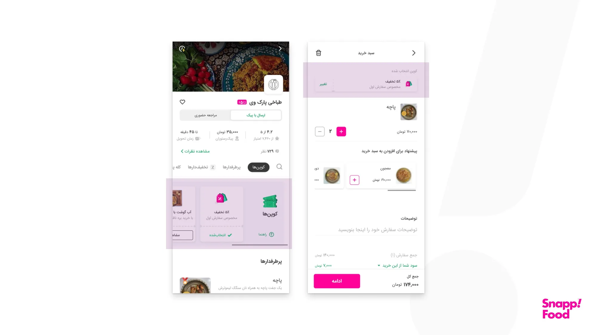
Cashback turnaround end to end: usage +40%, cost −58%.
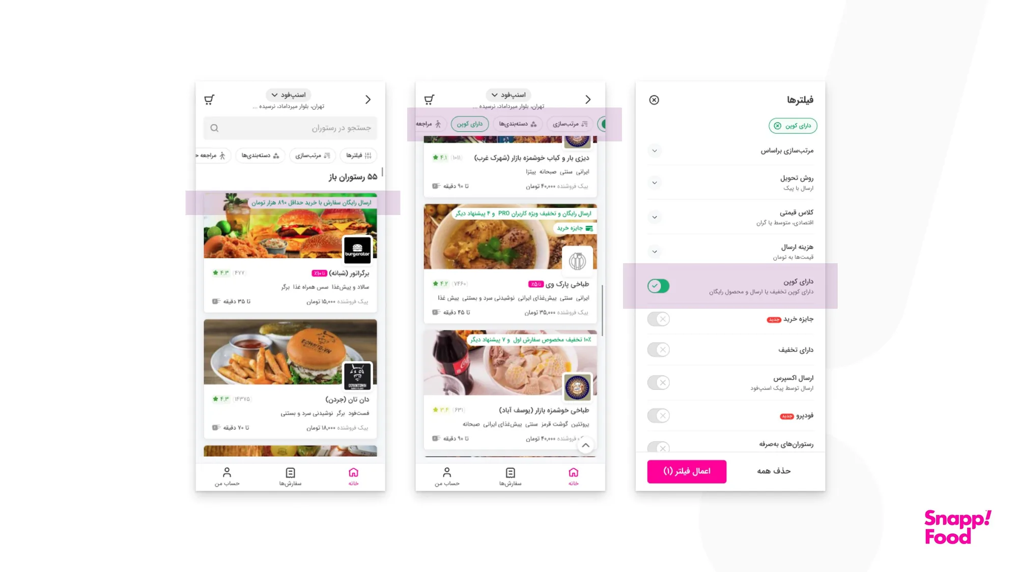
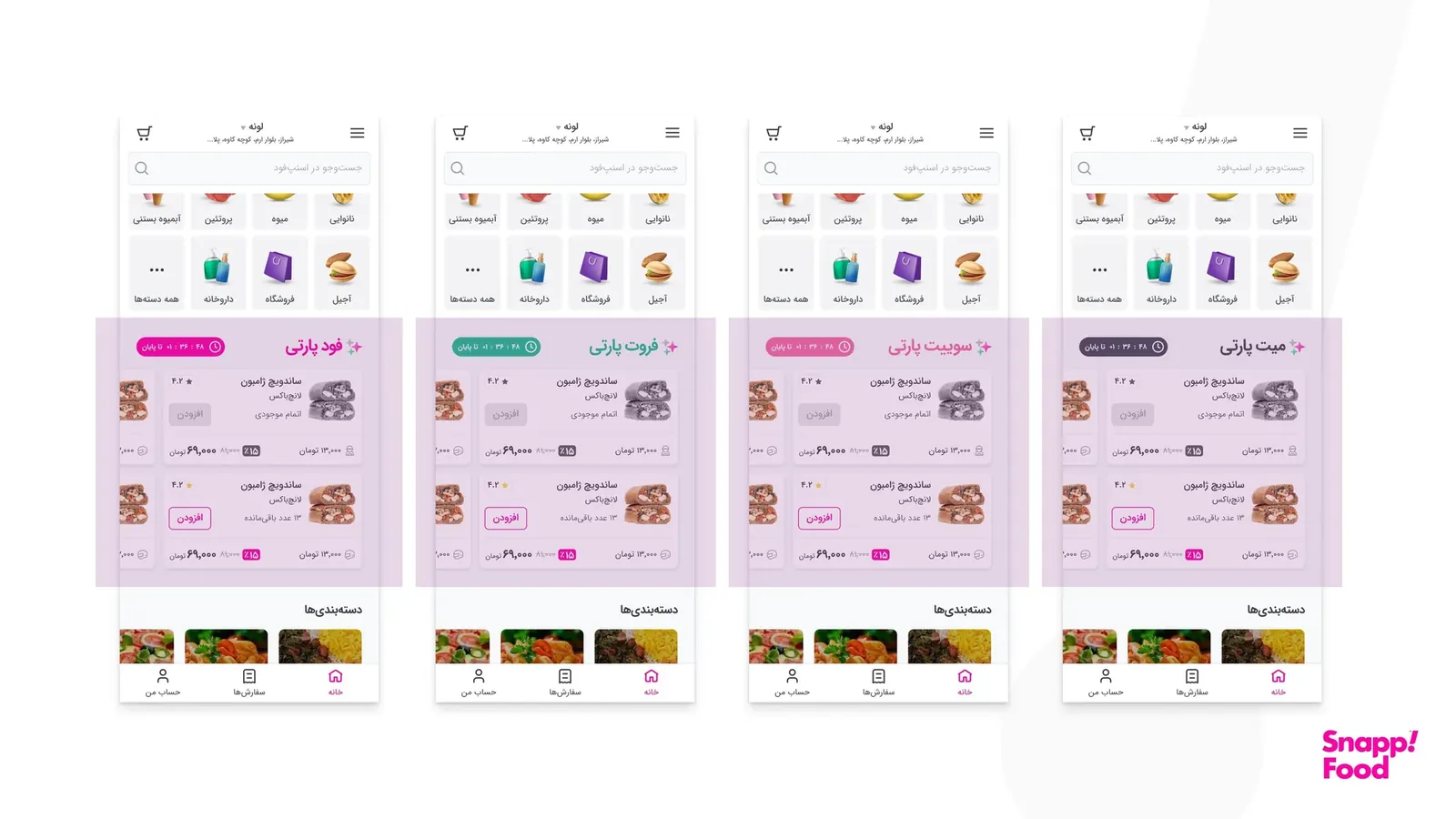
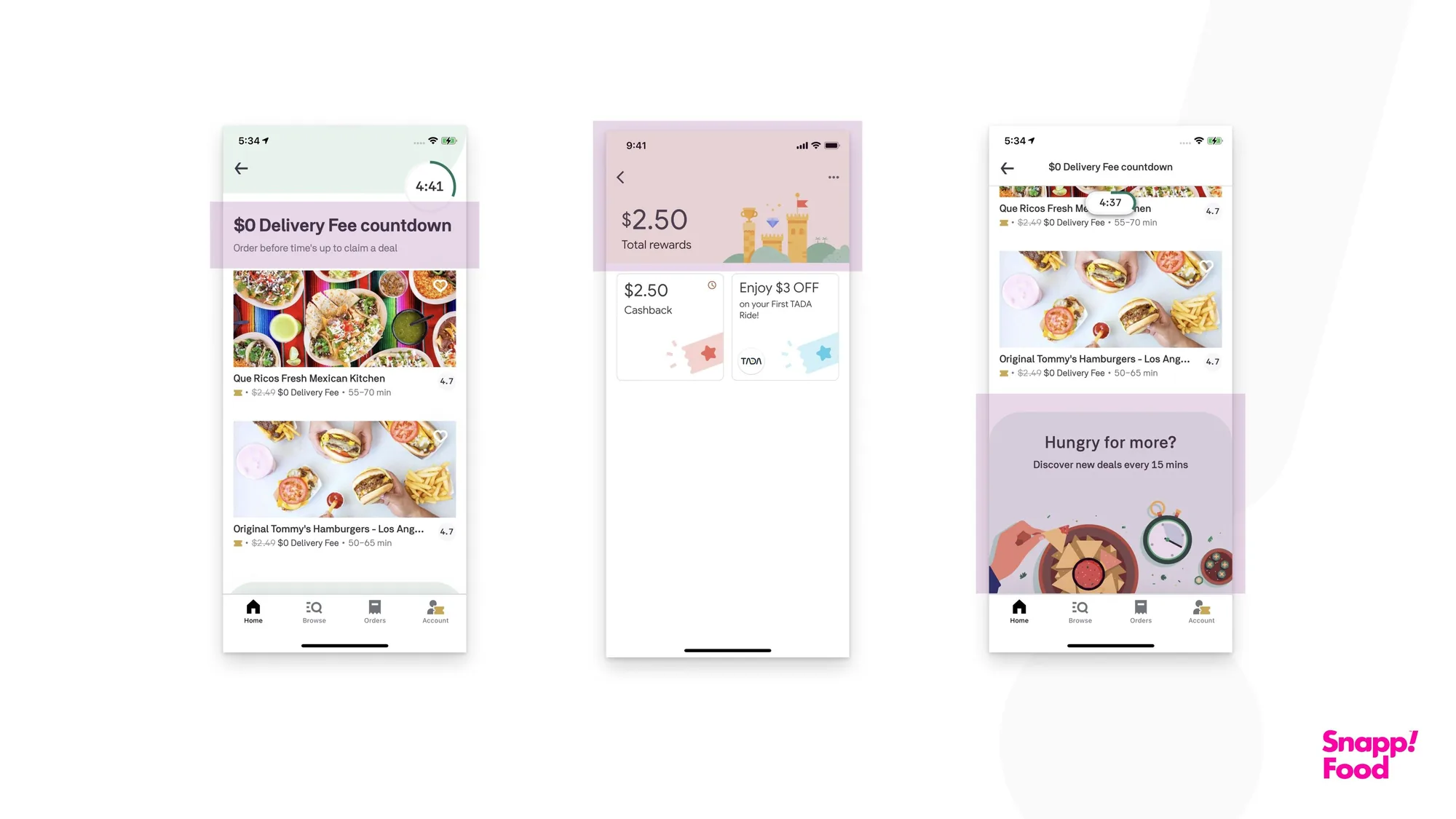
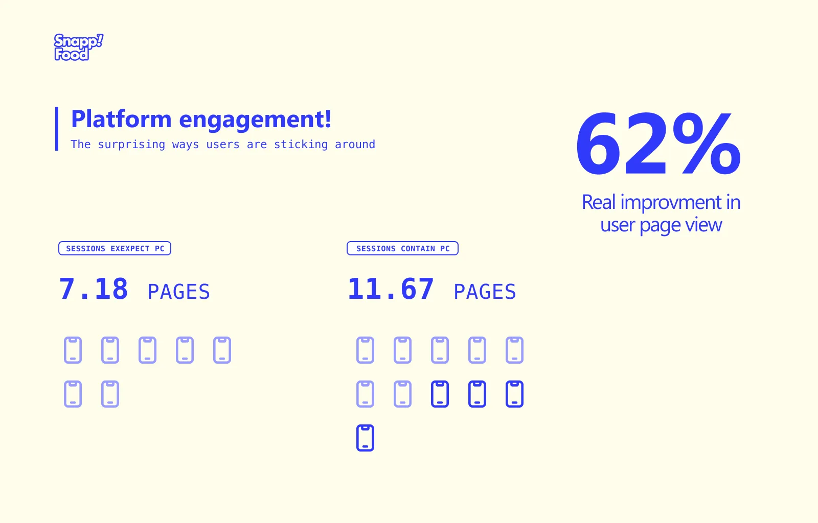
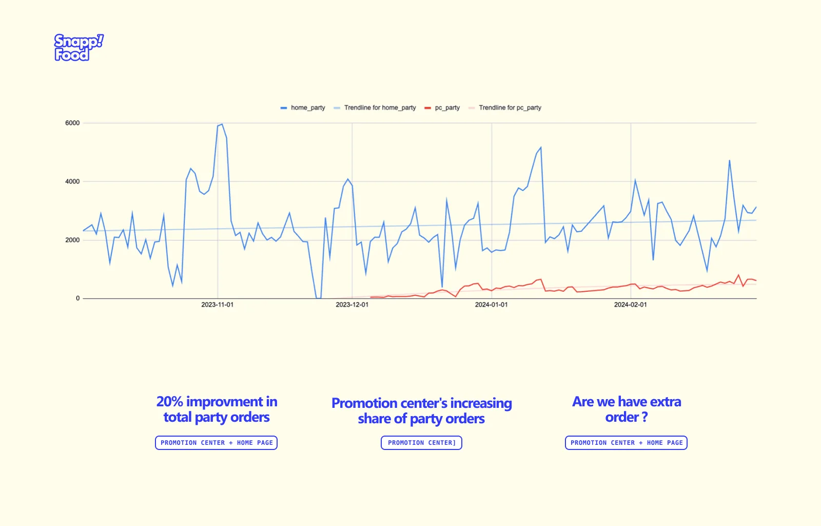
Shipped the Promotion Center: +20% party orders and +62% pages per session.
2022–2023
Fadak Trains1 yr
Product Design Team Lead
Jan 2023 – Sep 2023 · Full-time
Product Design Consultant
Oct 2022 – Jan 2023 · Part-time
Design speed +28% through an end-to-end research, prototype and test process.
A design system with four component libraries: UI design 20% faster.
50% fewer revisions and 2 new products brought to market.
2021–2024
Avand HRRecruitment platform · 3 yrs 4 mos
Senior Product Designer
Sep 2021 – Dec 2024
Recruitment and talent-management platform with AI-driven job matching.
Directed an end-to-end product redesign from cross-team research: 95% user satisfaction.
Ran delivery as de facto design PM across 5 cross-functional teams; timelines improved 20%.
2020–2023
Graph Inc.Full-time · 3 yrs 1 mo
Product Design Team Lead
Mar 2021 – Jun 2023
Product Designer
Jun 2020 – Mar 2021 · Tehran
Led the FAM product design team; products rated 4.5/5 by customers.
FAM product line revenue +25%.
Kiosk product: +20% sales; extended to FAM, +15% retention.
2020–2021
Hezardastan GroupPart-time · 1 yr 3 mos
Product Designer
Sep 2020 – Nov 2021 · Tehran
2020–2021
BluefoxAIFull-time · 1 yr
Product Designer
Sep 2020 – Aug 2021
AI, machine learning and data analysis applied to immigration, so applicants can manage their own application.
2020
apiEco6 mos
Lead UI/UX Designer
Apr 2020 – Aug 2020 · Full-time
UI/UX Designer
Mar 2020 · Freelance
A platform for designing, publishing, testing and managing APIs.
2018–2020
AnardoniSelf-employed · 2 yrs 5 mos
UI/UX Designer
Jan 2018 – May 2020 · Tehran
An iOS app store with over 1 million active users.
Led the UX research and design team.
Wireframes, storyboards, icons and campaign visuals.
2019
Cafe BazaarApprenticeship · 4 mos
UX Designer
Aug 2019 – Nov 2019
Iran’s Android app platform, with over 40 million users.
2019
BaladApprenticeship · 4 mos
UX Designer
Aug 2019 – Nov 2019
User testing and usability studies.
2019
BINATEBFreelance · 7 mos
UX Designer
Feb 2019 – Aug 2019 · Tehran
UI Designer
Feb 2019 – Jun 2019
Glasses lens replacement and eye exams from home.
UX for the Rx lens ordering flow; led the web and app design team.
“… he has a keen eye for state-of-the-art tools and design practices and he leveraged those in multiple occasions to improve our design-to-implementation pipelines. Additionally, he is a great researcher and the insights that he provided regarding user experience had a key role in determining the direction of our product.”
Armen JeddiPhD in Physical AI, University of Toronto & Vector InstituteManaged Sid directly · 2021
“Saeed has a great eye for detail, is great at benchmarking, and is a reliable teammate. He has a great view on design and knowingly strikes a balance between innovation and building effort. His presence in the team was critical, and I enjoyed every second of working with him.”
Pouria ShiriProduct ManagerWorked with Sid on the same team · 2025
“Saeed has a structured mindset and excels at breaking down complex problems into manageable parts. Saeed’s exceptional design skills and hands-on approach greatly contributed to our success. He understands the right direction to achieve outcomes, making him a valuable asset.”
Kamyab FarhadiFounder at DoctorPayManaged Sid directly · 2024
“Highly recommend Saeed! It was a pleasure working alongside him as a designer at Graph and Avand. … He possessed an exceptional eye for detail, ensuring designs were visually flawless and pixel-perfect. … Deadlines were never an issue for Saeed.”
“Throughout our two years of working together in the same hierarchy, his precision and agility have consistently stood out. His adaptability, discipline, and up-to-the-minute awareness are truly noteworthy.”
Arta MokaberiVP of Product DesignWorked with Sid on the same team · 2023
“Saeed is a professional UX designer. … He is always using the latest tools and resources to expedite tasks and processes and to offer the best solutions. His work ethic is impeccable and he is easy to work with.”
Marzieh YadegarDigital Product DesignerWorked with Sid at BluefoxAI · 2021
“He is an outstanding designer, who can clearly understand needs, users and standards. He has an excellent artistic sense too. In addition, his discipline that shows itself in timely reports and well-organized documentation of the project made me more than satisfied with the results.”
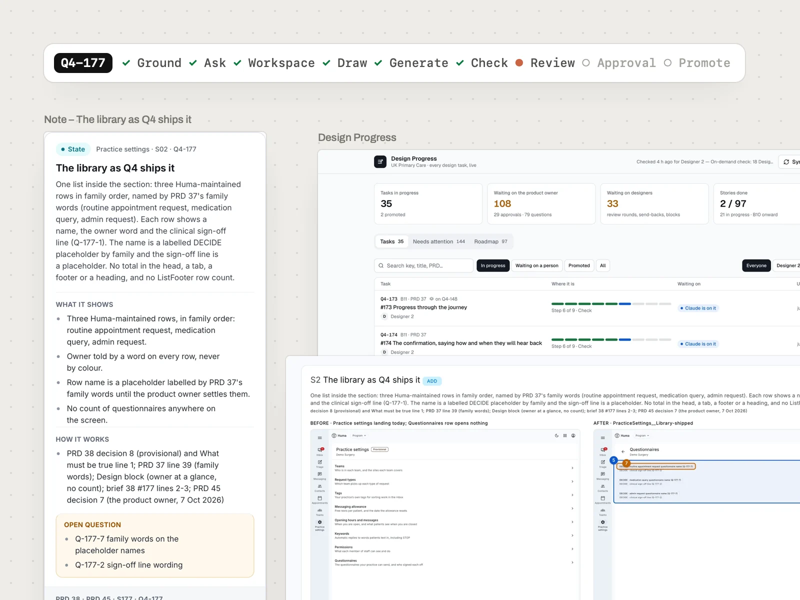
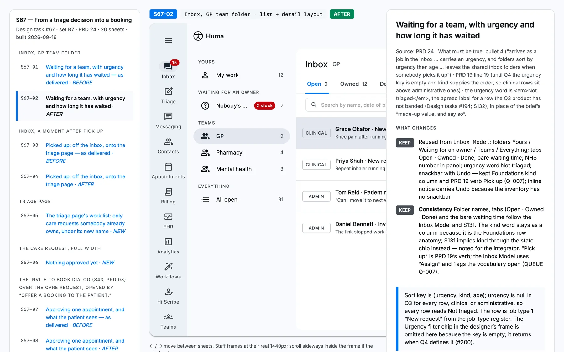
Two designers, one product owner and about a hundred stories a quarter, for software used inside NHS GP practices. I built a desk of AI agents that reads the requirements, draws from the design system and checks the work. People answer the questions and approve.
Role
AI Design Engineer. I led the design track of version one and designed and built version two end to end.
Who uses it
Two designers draw through it, a product owner approves, engineers build from its handoffs
Timeline
Version one in Q3 2026, inside git. Version two from 6 October 2026, on Claude artifacts.
Built with
Claude Code, Claude artifacts, GitHub, Jira, the NHS design system, a Material 3 kit
3 daysThe pilot set, from first read to promoted
5.5 hMedian from a story’s record to the designer’s sign-off
7 in 10Open questions settled before they reached the product owner
235Issues the checker caught before a person reviewed
Names, links, ticket numbers and anything clinical are removed or changed. The screens are real captures from the canvases, the board and the repo, with demo data.
The Design Desk in 75 seconds. The process, the agents and what changed, with sound designed for it.The challenge
A hundred stories a quarter, and no room to guess
Huma builds UK Primary Care, software for NHS GP practices: the inbox where patient requests land, triage, messaging and appointments. In Q3 the product team wrote 33 PRDs with 266 numbered decisions and asked for 90 design tasks. Q4 added 18 more PRDs and 98 stories. Two designers drew all of it.
Speed was only half of it. In healthcare, a wireframe that invents behaviour can ship a rule nobody decided. It happened once in Q3: a control that could write to a patient’s consent record made it into a design, and was caught only because a developer asked what to store.
14 states drawn
vs
6 states needed
One early brief came back with fourteen invented states where six honest ones were needed. The team’s own write-up put it plainly: the cause wasn’t carelessness, it was the format.
The other half was attention. Every open question either waited for the product owner or got answered quietly in a wireframe, where nobody would notice until it shipped.
Every state needs a source
A PRD line, a numbered decision or an acceptance criterion. A brief can rule something out. It can’t put something on screen.
Two design systems
Patient screens on the NHS design system, 390px first, WCAG 2.2 AA. Staff screens on a Material 3 kit at 1440px.
One person approves
The product owner’s attention is the bottleneck, so a question has to arrive researched, with options and a recommendation.
Version one · Q3 2026
A design loop inside git
The first version lived in the product team’s repo, next to the PRDs and decisions. Claude Code did the reading and the drawing through a set of skills and agents, and pull requests carried both the designs and the decisions.
My design track
The brief pack the first stories were drawn from
Before/after sheets: every state beside what it replaces, with its source
Handoff slices: one standalone file per story, every state one click away
Task audit: a ticket in, a change list out, each change citing its line
Handoff slicer: cuts a story’s screens out of the built prototype
The loop the team built around it
A desk that sent work to agents, each in its own git worktree
A decision helper that researched open questions and opened decision pull requests
A cold-read reviewer in a fresh context
A 14-check gate, lint scripts and CI on every design pull request
A Q3 handoff slice: one standalone file per story, here the staff inbox. Demo data.
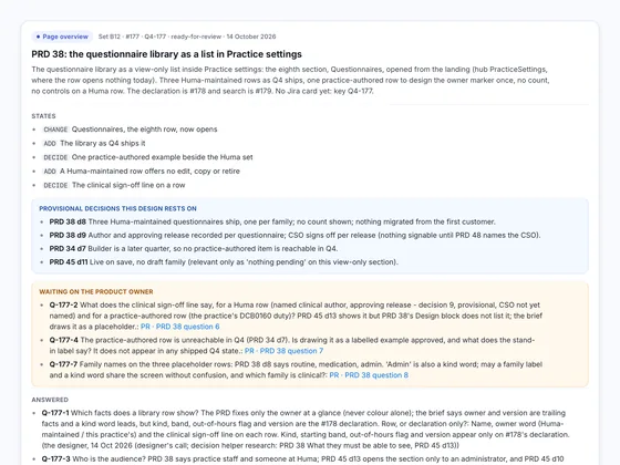
A Q3 before/after sheet. Every change carries its source; the list on the left steps through the story’s states.
76Stories designed and filed in git as deliverables
337Pull requests merged in four months
91%Of commits co-written with Claude
6 daysMedian from a brief to its first deliverable
What broke
The cost moved from drawing to everything around it
By September the loop worked, and it was heavy. One batch review, nine stories over a week, counted 38 pull requests, about twenty worker agents, 23 worktrees left on disk and seven clashing question numbers. Its conclusion:
“Nothing in the cull touches what produced the designs; all of it touches what was spent checking, recording and renumbering around them.”
0
Wrong drawings found by cold reads
Seven cold reads, about 90k tokens and five minutes each, found nothing wrong. None.
All
Of the product owner’s findings were absences
Nothing was drawn wrong. Things were missing: a state, a failure, a permission.
18 of 22
Sheet and slice pairs had lost their markers
13 of 21 on a stricter count. The two files were made separately, so open-question markers went missing without anything noticing.
44
Merges in September needed conflicts fixed
Most were in the one shared question file that every agent wrote to.
Q3 · made by hand, one file at a time
Handoff note
Before/after sheets
SliceMarker lost
Q4 · generated from one record
story.json
Cover
Before/after sheets
Slice
Hand-made files drift apart. Files generated from one record can’t, because there’s only one place to change.Decision log
Seven decisions for version two
I took those findings and redesigned the loop from scratch. Each decision gave something up.
01Git for knowing, canvases for drawing
Context
Designs in git meant pull requests for files nobody could review as a diff, plus worktrees and locks so agents wouldn’t collide.
Options
Keep everything in git · move everything into a design tool · split by job
Trade-off
Two places to keep straight, and design history that lives outside version control.
Outcome
PRDs, decisions and questions stay in git and change by pull request. Drawings live on Claude artifact canvases. Nothing designed goes to git.
02One record generates every handoff file
Context
Sheets and slices were authored separately and drifted.
Options
More checks on hand-made files · generate every file from one source
Trade-off
The record has to be strict. The generator refuses a state without a citation, a prop the surface doesn’t declare, or an open review item.
Outcome
A script with no model writes the cover, the slice, the before/after sheets, the notes and the state boards from one story record, then renders and checks every sheet.
03Check once, and look for what’s missing first
Context
Cold reads found nothing wrong, and the product owner’s findings were all absences.
Options
Keep repeat reads and the 14-check gate · one strong checker, run once
Trade-off
One pass has to count: a strong model, a fresh context, and no view of the drawer’s chat.
Outcome
Missing first, then invented, contradicted, drawn differently and off the design system.
04Cheap models read; strong models draw and judge
Context
Grounding a story means reading a lot. Drawing and checking need judgement.
Options
One strong model everywhere · a tier for each job
Trade-off
Agents hand work to each other, so every brief between them has to fit in ten lines.
Outcome
Researchers on a cheap model, the drawer and the checker on a strong one, the generator on none at all.
05Research every question before a person sees it
Context
The product owner’s attention was the bottleneck.
Options
Ask everything · decide in the wireframe · research first, then route
Trade-off
An undecided state ships as a labelled placeholder until someone answers.
Outcome
A decision helper settles what the sources already answer. Designer’s calls come with options and a recommendation. Only consent, safety, the patient record and billing go to the product owner, in one pull request per task.
06One workspace per story, promoted on approval
Context
Two designers, and many stories changing the same surfaces at once.
Options
One shared canvas · branches and locks · an isolated workspace per story
Trade-off
Copies to keep in step. A story built on another is brought up to date with a three-way merge, and a conflict stops for the designer.
Outcome
The product hub changes only on approval. Twenty of the first 37 stories were built on another story, up to five deep.
07Draw only from the design systems
Context
Hand-built parts drifted from the kit. As one review put it, correct and inconsistent is still a defect: a developer building it gets two components.
Options
Allow small hand-built parts · kit components only
Trade-off
A missing component blocks drawing until the design system has it.
Outcome
Kit component first, then patterns, then the shell, with no raw colour, spacing or type. A missing component becomes a finding for the design system.
Version two · Q4 2026
A desk of agents, and three stops for people
A designer opens one chat per story and gives the desk its key. The desk works out where the story is, runs the next step with the right agent and stops whenever a person has to decide. It orchestrates. It doesn’t draw, and it doesn’t decide.
Git · what we know
Read
Make and check
Canvases · what we draw
Hover or tap a part to see what it does and what it talks to.
Nine steps, three of them for people
One story, nine stepsPerson Agent Script, no model
People
Agents
Script
Git: what we knowPRDs, decisions and open questions. Answers land by pull request. Nothing designed goes to git.
Canvases: what we drawOne workspace canvas per story, promoted into the product hub and its area’s state board once approved.
01 · Ground
Read everything before drawing anything
A researcher agent on a cheap model reads the Jira card, the PRD, the decisions and the brief, then sweeps every canvas for parts that already exist. It writes the story record: each state with the line that asks for it, what gets reused, what stays out and what nobody has decided yet.
In
Jira card, PRD, decisions, brief
Out
The story record, version 0
RuleEvery state cites a PRD line, a decision or an acceptance criterion. A brief can forbid things; it can’t authorise them.
Story recordA real Q4 story
ChangeThe settings row now opens its sectionPRD 45 · decision 13
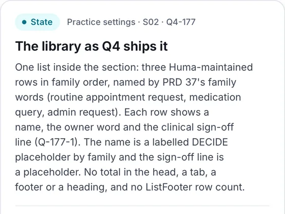
AddThe library as it ships this quarterPRD 38 · decision 8
AddA maintained row offers no edit, copy or retirePRD 38 · What must be true
DecideThe sign-off line on a rowOpen question · Q-2
7 of 10Parts reused or adapted from the hub
18Not drawn, each with an owner or reason
8Open questions
02 · Ask
Ask before drawing, one question at a time
Every open question goes to a decision helper first. It searches the PRD and decision notes, then NHS England and ICO guidance, then peer products. Settled questions get dropped. The rest come to the designer one at a time, with options and a recommendation, and every answer is recorded in git.
In
The record’s open questions
Out
Answers recorded in git
RuleWhen two approved sources disagree, the story stops. Nobody quietly picks one.
Question Q-5Designer’s call
No source gives a row order. Which order should the list use?
Maintained rows first, in the PRD’s family orderRecommended. Stable, with no recency.
AlphabeticalMixes the two owners together
Most recently used firstThe PRD keeps recency for the composer
1Answered by the sources
4Designer’s calls
3To the product owner
The same story’s eight questions. Anything touching consent, patient safety, the record or billing goes to the product owner.
03 · Workspace
A private canvas for every story
The desk agent opens a new canvas with the four design systems installed, copies in the surfaces the story changes and freezes a BEFORE copy of each. If another open story already changes the same surface, the new one is built on top of it and kept in step with a three-way merge.
In
The surfaces the story changes
Out
A workspace with frozen BEFORE copies
RuleWork happens on the workspace. The product hub changes only after approval.
WS · Story 1772 pages · 15 boards
Surface, from the hub
BEFORE · frozen 14 Oct
Material 3 kitShellPatternsNHS design system
Built on another story? The surface comes from that story’s workspace, not the hub’s older copy.
04 · Draw
Draw each state from the kit, nothing by hand
The drawer agent, on a strong model, adds each state to its surface as a scenario preset, built only from design-system components and tokens. When the kit lacks a component, that goes back to the design system as a finding instead of being hand-built on the surface.
In
The record and the workspace
Out
Every state as a scenario on its surface
RuleNo raw colour, spacing or font size that isn’t a token.
Practice settings · scenario
OpensAs shippedPractice rowNo controlsSign-off
Maintained
Maintained
DECIDE · the sign-off line
ListItemFocusIndicator--schemes-outline from the kit, never retyped
05 · Generate
One record makes every handoff file
A script with no model builds the cover, the handoff slice, the before/after sheets, the notes and the state boards from the one story record. Sheets are rendered and checked headlessly, and any lint error stops the run. Nobody edits these files by hand, so they can’t drift apart.
In
The story record
Out
Five handoff files, always in sync
RuleNever hand-edit a generated file. Change the record and run it again.
story.json5 states 18 not drawn 8 questions
CoverStart here
Handoff sliceEvery state, one file
Before/after sheetsNumbered changes
NotesOne per state
State boardsBy product area
Lint passed · every sheet rendered and checked
06 · Check
Look for what’s missing first
A checker agent with a fresh context reads the design once. First it looks for what’s missing, then anything invented, contradicted, drawn differently from its source or off the design system. In one review batch, every finding the product owner raised was something missing, so absences come first.
In
The drawn workspace and its record
Out
Findings, each tied to a state
RuleEach state covers permission, validation, loading, empty, failure, recovery, expiry and concurrency, or says why it doesn’t.
Checker, round 07 findings · all applied
MissingThe AFTER frame repeats BEFORE, so the opened section isn’t shown
InventedNothing found
ContradictedTwo decisions marked provisional had already been approved
Drawn differentlyPlaceholder rows don’t use the PRD’s own words
Off the design systemA placeholder box built by hand with raw sizes
07 · Review
Review comments become the to-do list
The designer reviews on the canvas. Each comment becomes a round item, word for word, gets fixed, and the files are generated again. Draw, generate and check repeat for as many rounds as it takes, until the designer says it’s done.
In
The checked workspace
Out
Applied rounds, logged in the record
RuleComments are kept verbatim. The record holds the history, not anyone’s memory.
Designer roundsKept word for word
r2.1
“Make the height of all these pages fit the content inside them.”
AppliedEvery state board and BEFORE frame now takes its content’s height, measured headlessly.
c1.2
“Mount NHS TextInput for the pre-filled text field … drop the hand-built input.”
AppliedThe field is the kit’s TextInput, so its error states work too.
From a real Q4 story: one comment on the canvas, one during the checker’s round.
08 · Approval
One place for the product owner to look
Every task has one pull request for the product owner, holding its questions, the request to approve and the outcome. When the designer says done, the task is marked ready on the Design Progress board. The product owner approves there, or sends it back with a note and another round begins.
In
A task the designer has signed off
Out
Approved, or sent back with a note
RuleOne task, one pull request. A designer’s own call never goes there.
Design ProgressLive board
Story 177 · Library listReady for approval
Questions
5 answered · 3 waiting
Built on
No other story
Pull request
One, for all of it
ApproveSend back with a note
09 · Promote
Promote the work, then close the workspace
Once approved, the desk agent moves the surfaces and the handoff into the product hub and puts every state, with its note, on its area’s state board. Jira gets the link after I confirm, and the workspace closes.
In
An approved workspace
Out
An updated hub and state boards
RuleA promotion isn’t done while any state is missing from its area board.
Set B14 · Practice settingsStories 160 and 161Closed · promoted 9 Oct
Product hubSurfaces and a handoff page
State board · SettingsEvery state, with its note
JiraThe link, posted once I confirm
Step 1 of 9Ground
Huma · UK Primary Care · Design kit v1
UK Primary Care Design Playbook
How a story goes from a Jira card and a PRD to an approved design, with agents reading, drawing and checking, and people answering and approving.
Two places, two jobs
Git · what we knowPRDs, decisions, questions, briefs
The knowledge base. The decision helper records answers by pull request, and the product owner approves by merging.
Artifacts · what we drawHub, area canvases, workspaces, design systems
Each story is drawn in its own workspace canvas, promoted into the hub on approval, and the workspace closes.
RuleNothing designed goes to git.
One story, nine steps · pick one below
01
Groundresearcher · cheap model
Agent
Reads Jira, the PRD, decisions and the brief, then searches every canvas for parts that already exist. Writes the record: each state with its citation.
Agents read, draw and check. People answer, review and approve.
Tasks built on tasks
Task B · built on A v3Changes the same surfaceCopies it from task A’s workspace, not the hub’s older copy
Task A · v3Waiting for approvalEvery change bumps its version
RebaseWhen A changes, the desk merges it into B with a three-way merge.
ConflictA clean merge carries on; a conflict stops and asks the designer which version wins.
OrderThe board flags a task that is behind. A is approved and promoted first, or the stack together.
Start a session · the one prompt
Read kit/BOOT.md, kit/README.md and kit/RULES.md from the Design Playbook artifact, run its First session checks, then run kit/skills/atlas-desk.md for story <KEY>. Talk to me in my language; everything inside the design stays English.
First session · stops at the first check that fails
GitHubThe knowledge repo can be read
JiraThe connector reaches the project
ArtifactsThis page, the progress board and the hub are shared
Daily checkIts own routine, every weekday and on Sync now
Desk ready · story Q4-177
The canvases · who writes where
Design ProgressLive board: every task and which step it is onthe desk, after every step
HubOne copy of every surface, plus a handoff page for each setpromotion only
State boardsOne per area. Every promoted state sits here, with its notepromotion only
WS · <KEY>The isolated workspace for one story, closed after promotionthe drawer
Design systemsMaterial 3, shell, patterns, NHS: the only source of componentschanged there, then reinstalled
What carried over from Q3, and what didn’t
Kept
Ask before drawing. Never redraw a part that exists. Every state cites a PRD line, decision or criterion. The product owner’s words, verbatim. Cheap models read; strong ones draw and judge.
Dropped
Pull requests for designs, worktrees, locks, the 14-check gate and repeated cold reads. A review measured zero wrong drawings found by repeat reads.
New
One record generates every handoff file, so the slice and the sheets can’t drift. The checker looks for absences first: every finding in that review was something missing.
The kit behind the page
kit/BOOT.mdFirst-session checks, then the hand-off to the desk
kit/README.mdHow the desk works, end to end
kit/RULES.mdThe rules every agent keeps
kit/agents/roles.mdWho reads, who draws, who checks, on which model
kit/skills/atlas-desk.mdThe desk: runs a story through all nine steps
kit/scripts/atlas.mjsGenerates the handoff from the record, lints, rebases
kit/schema/story.mdThe shape of the one record
kit/examples/story.jsonA finished record to copy from
Agents run six steps three wait for a person: an answer, a review, an approval
The playbook is the handover. Open any section: whoever designs next shares this page, pastes one prompt, and their Claude checks its own access and sets itself up from the kit behind it.The desk at work
One story, start to finish
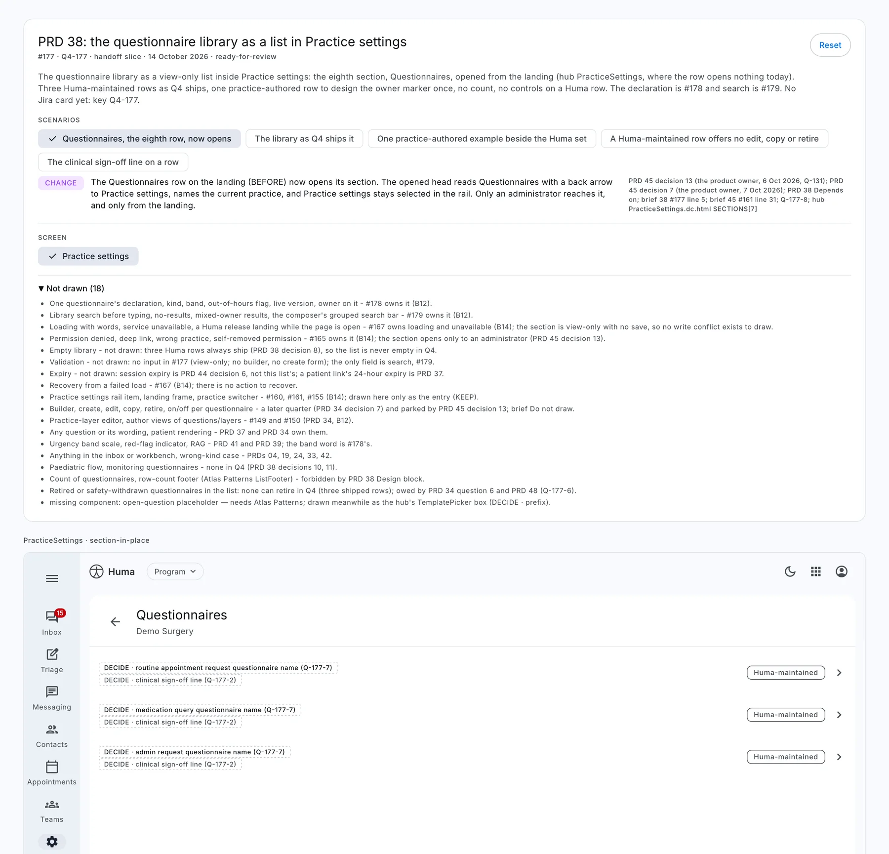
Here is one real Q4 story, a list of questionnaires inside Practice settings, from the designer’s chat to the board the product owner approves on.
It asks before it draws
Every message that moves a story opens with a one-line progress bar. Every question comes with options and the recommended one first, so a decision takes a click, not a meeting.
Check is done. The checker raised 7 items and all 7 are applied: the AFTER frame now shows the opened section, placeholders use the hub’s DECIDE box, and the three open questions link to the product owner’s pull request.
Five states are on the canvas with their notes, the slice and the before/after sheet. It’s with you for the design review.
Ran the checkerApplied round 0Regenerated 5 files
Review
How does the canvas look?
Done: ready for the product owner (Recommended)Marks it ready on the board and adds the approval request to its pull request
I have correctionsComment on the canvas; each comment becomes a round item, word for word
DeferLeave it in review
Redrawn from the desk’s real message format. The details come from a real Q4 story: its record lists eight questions, of which one was answered by the sources, four were the designer’s calls and three went to the product owner.
One record, five files
The researcher writes the story record before anything is drawn: each state with the line that asks for it, what gets reused, what stays out and what’s still open. The generator turns that one file into everything the team opens.
{"key": "Q4-177",
"status": "ready-for-review",
"states": [{
"id": "library-shipped",
"kind": "ADD",
"label": "The library as Q4 ships it",
"cite": "PRD 38 d8; PRD 37 line 39",
"before": { "surface": "Before_PracticeSettings" }
}, … 4 more],
"notDrawn": [18, each with its reason or owner],
"questions": [8, answered or sent to a PR],
"rounds": [{ "by": "checker", "items": 7, "applied": 7 }]
}
CoverStart here: states, open questions, rounds
Handoff sliceEvery scenario one click away
Before/after sheetsNumbered changes on both frames
NotesOne per state, with its sources
State boardsFiled by product area
Everything on one canvas
Drag to explore the canvas
Real boards from one story’s workspace, in the order the generator lays them out: the frozen BEFORE, the cover, the slice, each state with its note, and the sheets.
The handoff engineers open
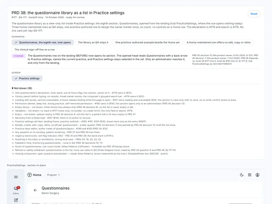
The slice. Scenario chips switch the live screen; each state shows its kind, its note and its sources, and the eighteen things deliberately not drawn are listed with their owners.
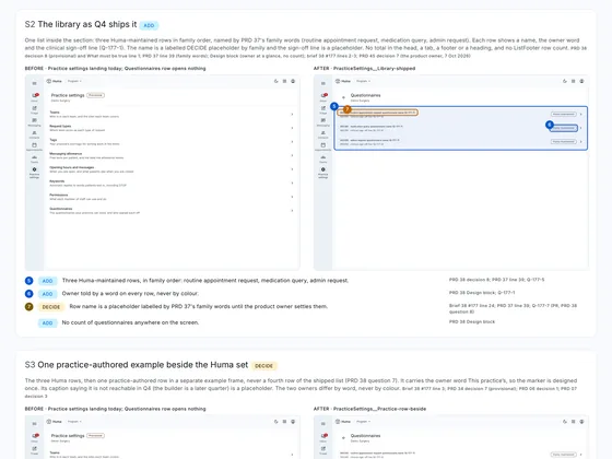
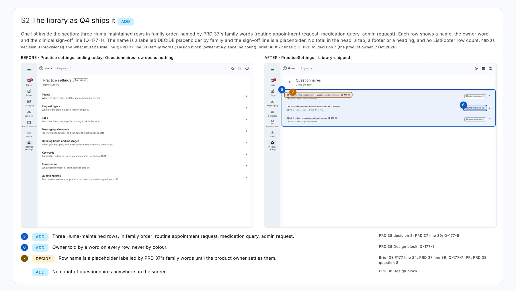
A sheet. Numbered outlines are baked in and checked: a mark that’s missing, ambiguous or off its element stops the generator.
A checker that looks for what’s missing
The checker reads the PRD and the brief itself and never sees the drawer’s chat. It reports in a fixed order, absences first, and anything it can’t cite it doesn’t report.
235Findings across 27 stories
8Median per story, from 4 to 16
13Stories where nothing was invented
What the checker found, by kindSix stories with a full breakdown · 57 findings
Missing19
Sheet or record out of step16
Off the design system8
Drawn differently from its source6
Contradicts a source5
Invented3
Show as a table
Kind
Findings
Missing
19
Sheet or record out of step
16
Off the design system
8
Drawn differently from its source
6
Contradicts a source
5
Invented
3
MissingThe AFTER frame showed the same picture as BEFORE, though the note promised the opened section.
Off the design systemA placeholder box was built by hand with raw sizes, while the hub already had the same open-question box.
Contradicts a sourceTwo decisions were listed as provisional, though the product owner had already amended and decided both.
One place for the product owner
Each task has one pull request for the product owner, holding its questions, the approval request and the outcome. The board shows every story’s step and who it’s waiting on; approval is one button, or a note that sends it back.
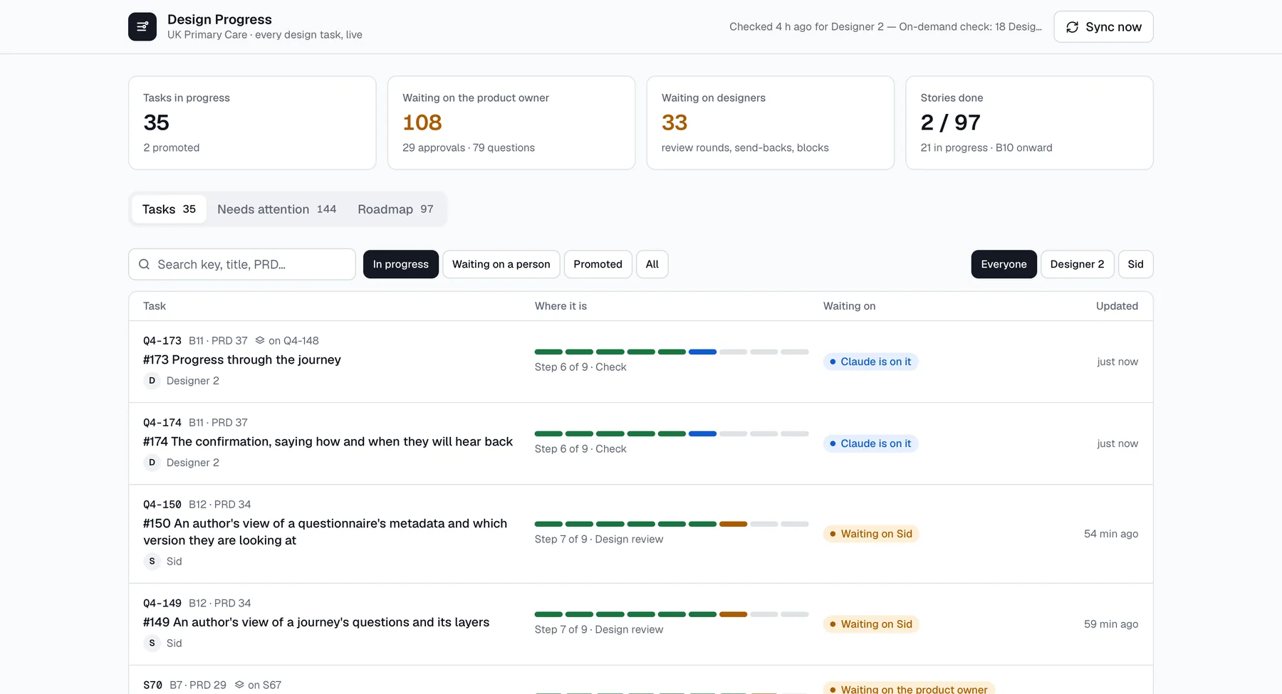
The Design Progress board on 14 October. Each row shows the story’s nine-step bar and who it’s waiting on.
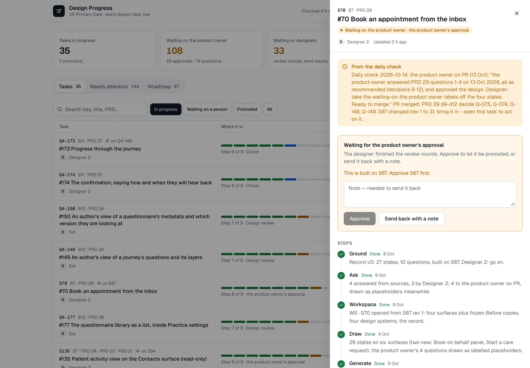
One story open: the approval card, and every step with its date and what happened.
Stories built on stories
When a new story changes a surface an unapproved story is still changing, it’s built on top of it. Each change underneath bumps a revision, and the desk brings every story above it up to date.
Each question type, shown accessiblyrev 2
Answers, files and lookups refusedrev 1 · built on rev 2
A pre-filled answer, marked as suchrev 3 · built on rev 1
The point a branch changed the questionsrev 1 · built on rev 3
Progress through the journeyrev 1 · built on rev 1
A real stack, five deep, on 14 October. A clean three-way merge carries on; a conflict stops, and the designer picks which version wins. That day three other stories sat behind their parent, each flagged on the board with “bring the change in”.
Every bug became a check
In its first week version two drew dozens of stories, and some came out wrong in the same way more than once. I didn’t fix them one by one. Each kind of mistake became a check the generator now runs every time.
A “new” BEFORE where an old screen existedBEFORE now comes from the truest source there is, down to the old Figma frame, and each change points at the region it replaces.
36
Dialogs missing from AFTER framesFrames are pinned to their board’s size, and the sheet check renders each one as the canvas does and fails a dialog outside it.
19
Change rows describing an earlier draftA row compares BEFORE with AFTER, never with a draft, and the checker reads the sheet once.
13
Marks on the wrong elementA mark whose words match more than one place has to say which; the sheet check fails it otherwise.
5
Note boards the wrong heightEvery note is rendered and its board fitted to the measured card; a note with more than 8px to spare fails.
All
Impact
Faster, and every state on the record
Stories signed off by the designer, per dayVersion two’s first eight days, 7–14 October · 31 stories
27 Oct
28 Oct
39 Oct
410 Oct
011 Oct
1712 Oct
213 Oct
114 Oct
Show as a table
Day
Stories signed off
7 Oct
2
8 Oct
2
9 Oct
3
10 Oct
4
11 Oct
0
12 Oct
17
13 Oct
2
14 Oct
1
3 days
The pilot set, end to end
First read to promoted, through review and approval
Two Practice settings stories were grounded on 6 October, signed off on the 7th, approved on the 8th and promoted on the 9th.
5.5 h
Record to sign-off, median of 15 stories
The fastest took 70 minutes
Measured from the accepted record to the designer saying done. In Q3 the median from a brief to its first deliverable was six days. They’re not the same measure, but the gap is the point.
Same day
Time to ask a question
Down from 21 days in August
The median time from raising a question to putting it to someone fell to one day in September and the same day in October.
7 in 10
Questions settled before the product owner
About 223 settled, 89 sent on
Settled from the sources or by the designer. What reached the product owner touched consent, safety, the record or billing.
350
States on the area boards
Every promoted state, with its note
Filed by product area, from the inbox to patient screens, so the next story starts from what’s already decided.
The playbook is written so whoever designs next starts from one prompt, and the rest of the organisation is now moving to the same way of working.
What I’d change. Drawing got fast enough to move the queue: by mid-October, 29 stories were waiting for approval. The next version has to make approving as cheap as asking already is.
Reflection
What building it taught me
01
Agents draw well and decide badly
So nothing in the system lets them decide. Undecided behaviour becomes a labelled placeholder and a question, never a guess.
02
Missing beats wrong
The expensive mistakes were absences: the empty state, the failure, the permission. Looking for them first changed what reviews found.
03
Make the record the product
Once one file held every state, citation and decision, the handoff files came for free and could never disagree.
04
Design the stops, not just the screens
The hard part was deciding where a person has to stop the line, and making each stop cheap: one question, with options.
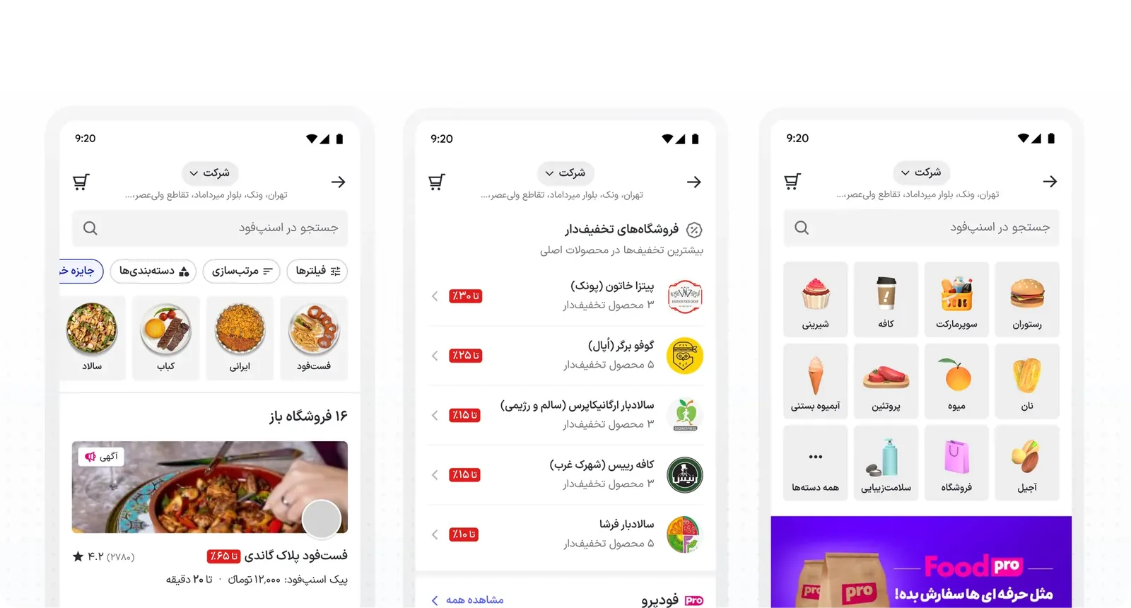
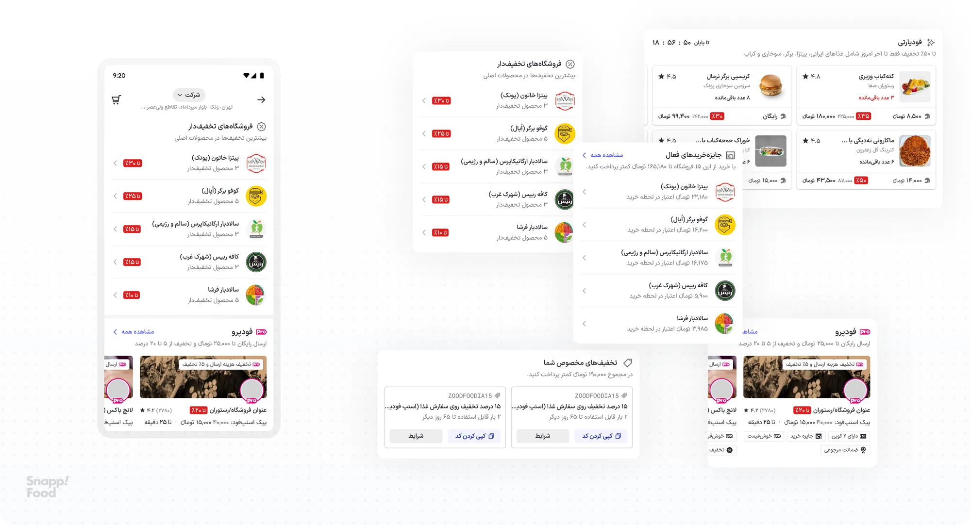
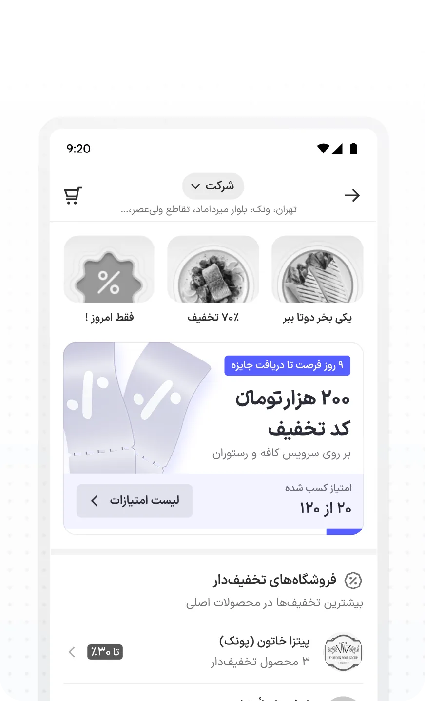
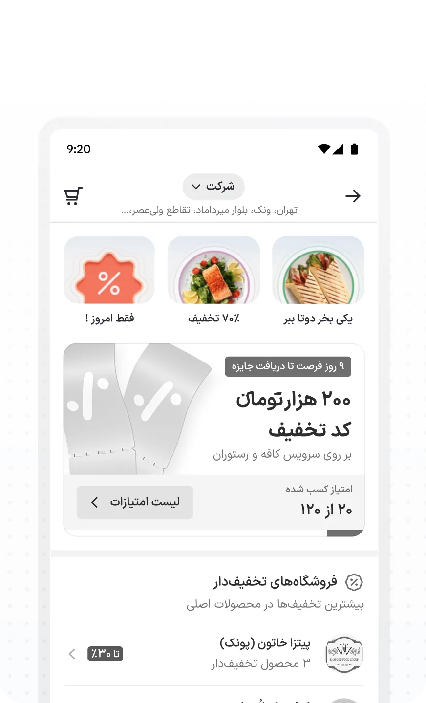
A new discovery journey for people who order by price. Every cashback, coupon, party and discount in one place, instead of scattered across a 12-year-old app.
Role
Senior Product Designer
Team
8 engineers, 3 PMs, 1 EM, 2 product designers
Extended teams
Ads, Promotion, Search & Discovery, Commercial & Business
Timeline
One delivery cycle, as the team’s biggest initiative
+20%Total party orders
+62%Pages per session, vs sessions without it
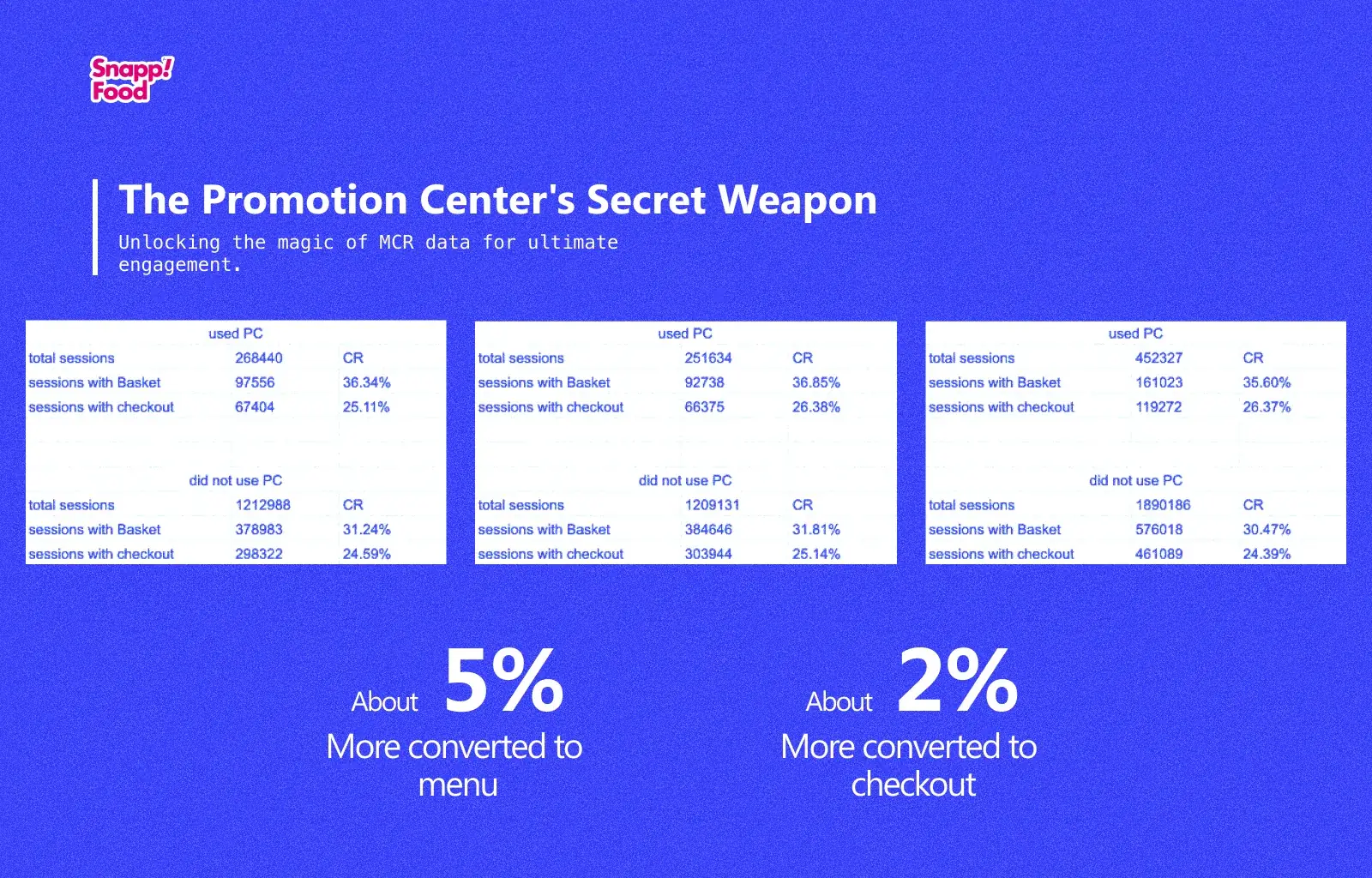
+5 ptsSessions that reached a basket
The business problem
Deals were everywhere, and nowhere
Promotions at Snappfood come in many forms: cashback, eco food, food packs, coupons, discounts. They exist to attract people who want to pay less. But they were fragmented across the app, so the people who cared most about them had the hardest time finding them.
Vendors couldn’t showcase offers
There was no place at the start of the journey to put a promotion in front of customers.
Promotions lacked impressions
Low visibility meant low engagement, so vendors saw little return on their offers.
Deal-seekers took too many steps
Users looking specifically for promotions couldn’t reach those vendors in a few taps.
Build different discovery journeys for different user segments, so each one finds the promotions it actually wants.
Prioritizing
Three ways in. We picked one.
We could grow the business impact of promotions in three ways. Customer experience was where the existing problems hurt most, and it would teach us how the system really behaved before we touched the vendor side.
01
More variety of promotions
Increase the kinds of offers available.
02
Better vendor tools
Improve promotion creation and reporting for vendors.
We started here03
More promotion use by customers
Help customers find and redeem promotions.
Data gathering
What the funnel told us
We started with a few questions. Do users understand what a promotion is worth? Is behavior consistent across promotion types? Does it matter how many promotions a user engages with, or how many get redeemed overall? To answer them, we analyzed user and business data along the product funnel.
Average order value rose about 3% in a year
It came from higher prices, not from changed behavior.
Some promotions lost money
Cashback in particular had become less profitable.
High cognitive load
Many promotion types meant more to process and longer loading times.
It looked like spam
Too many promotions with too little explanation felt like noise.
The old version
Three systems, three entry points
Two kinds: a percentage of the order credited back, or a fixed amount regardless of order size. Users met cashback in their profile (balance and history) and at checkout (what they’d earn).
Right: a percentage of the paid amount. Left: a fixed amount.
Right: access from checkout. Left: access from profile.
Coupons unlock when a condition is met: free shipping over 890,000 tomans, 30% off a first order, a free side with a specific burger. They appeared on vendor cards, filters, menus and the basket. Users rarely filtered by coupon; most activated one from the menu once their basket qualified.
Through the vendor card, filter suggestion and filter modal.
Through the coupon section in menu and basket.
Parties run on four services (food, fruit, sweets and meat) and sit on Snappfood’s home page. They discount selected items, and drive about 4.7% of Snappfood’s sales.
Party types: food, fruit, sweets and meat.
Target users & metrics
Who it’s for, and how we’d know
Active cashback users
Know the benefits and actively look for lower spending.
Price-sensitive users
Search for discounts and promotions to save on every order.
Food Pack visitors
Already aware of Food Pack and come to learn what it offers.
Higher micro CR from discovery to menu for vendors with promotions.
Less time spent on discovery.
More use of displayed promotions: active cashback, discounted vendors, personal discounts, coupons, parties, buy-one-get-one.
Total micro CR from discovery to menu, starting at 79%.
Drop-off rate during discovery.
RPD (revenue per delivery) as a key indicator.
The risk we named up front: redirecting a big share of homepage traffic (for example, half of it) to a new page we didn’t yet understand could pull discovery-to-menu conversion down.
Hypothesis
A dedicated page for deal-seekers
Give price-sensitive users one discovery page that features vendors with promotions, and make its impressions and conversion match the home page and listings. The page needed three ways in.
A prominent place in the app’s navigation menu.
A dedicated section or filter inside the home page and vendor listings.
Promotional campaigns and notifications that drive awareness and bring people back.
Campaigns & notifications
Promotional campaigns and notifications point people to the Promotion Center to build awareness and engagement.
Design process
What others do with deals
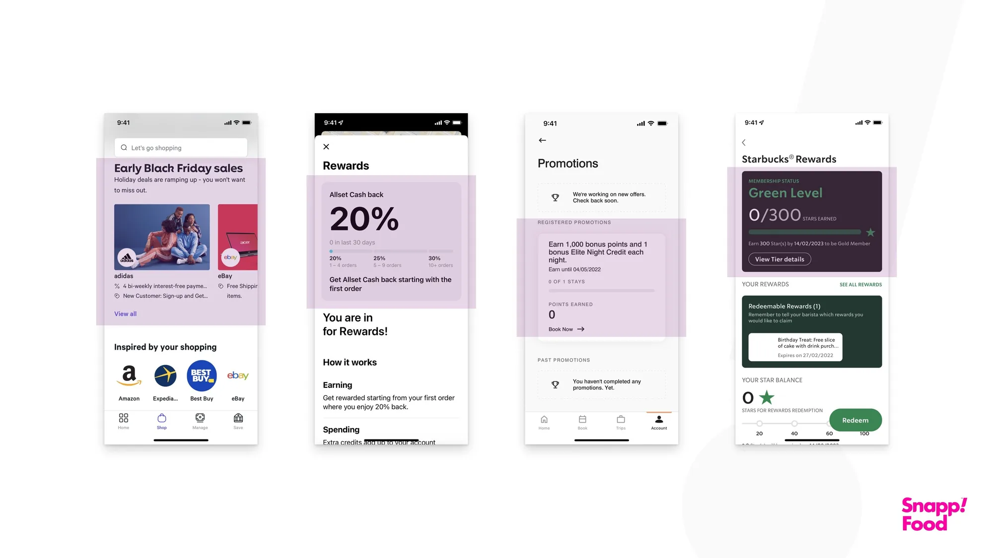
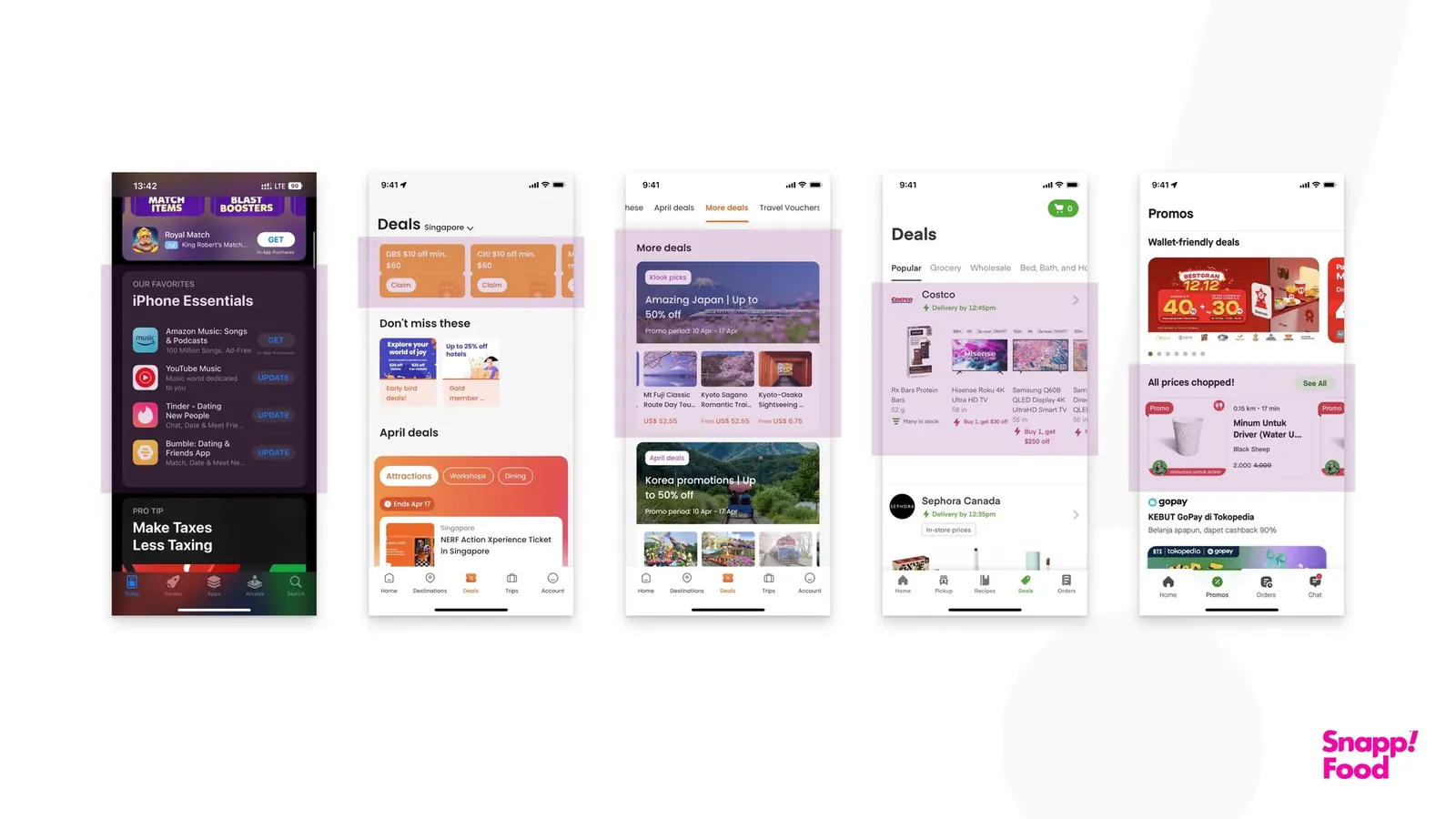
We reviewed the promotion, reward and offer sections of competitors for first and last impressions, and for patterns that could work for single promotions and for bundles of products or vendors.
Reviewing first and last impressions.
Design patterns that could carry a promotion.
Patterns for product bundles and vendor collections.
Borrowed from the App Store and Netflix
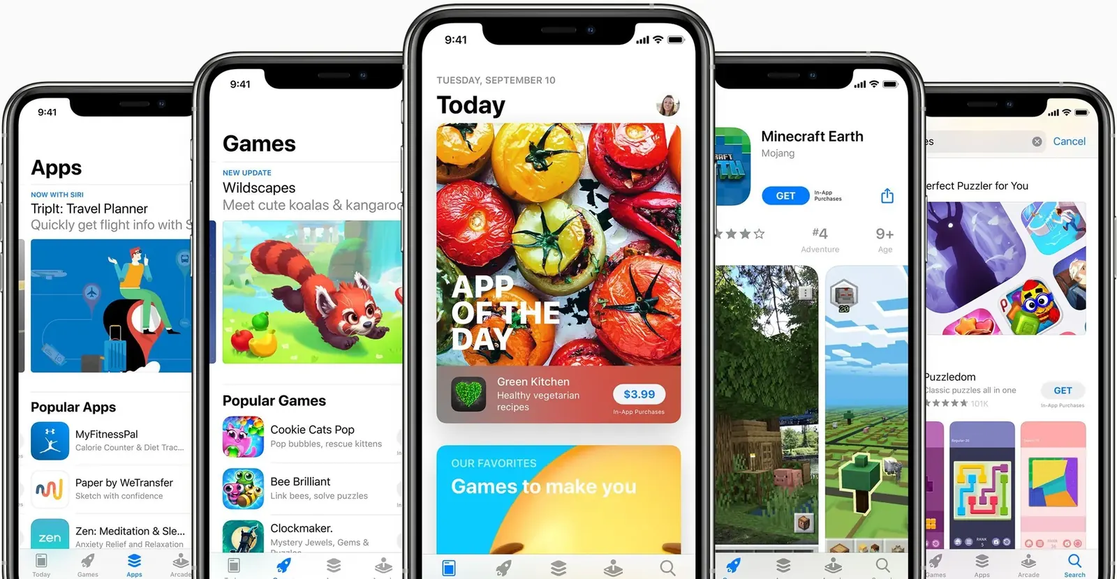
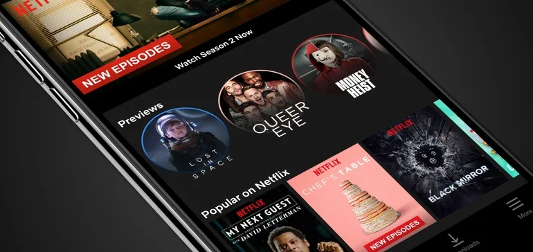
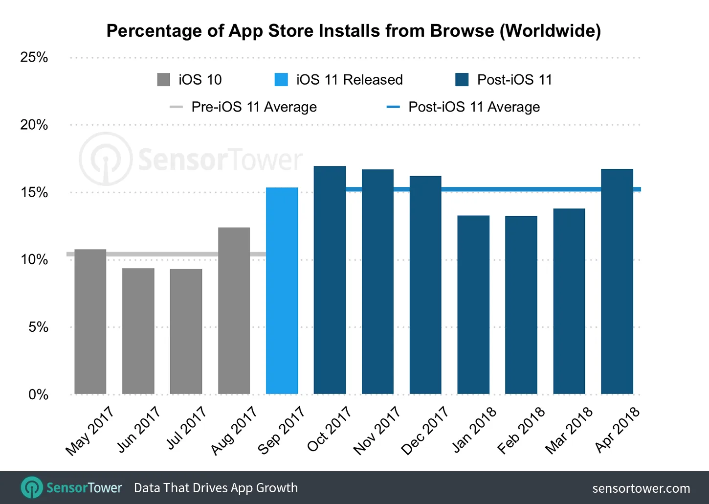
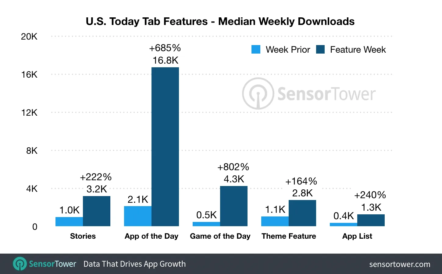
The App Store’s Today tab raised installs from browsing by showcasing the best apps every day as a feed. Netflix’s home screen and Previews drive discovery the same way. Both pointed at a dynamic, personal, content-led Promotion Center.
App Store, Today tab.
Netflix, Previews.
Share of App Store installs from browse, before and after iOS 11. Source: Sensor Tower.
Median weekly downloads for apps featured in Today. Source: Sensor Tower.
We aimed for less time in discovery. Sessions that included Promotion Center were longer instead: 11.67 pages, against 7.18 in sessions without it.
+5 pts
Sessions that reached a basket
People who used it converted better
Across three periods, sessions that used Promotion Center reached a basket about 5 points more often (36% against 31%) and reached checkout 0.5 to 2 points more often. It compares people who chose to use it with those who didn’t; it wasn’t an A/B test.
+20%
Total party orders
A new home for party orders
Party orders from the home page and Promotion Center together rose 20%, and Promotion Center’s share kept growing.
Pages per session: 7.18 without Promotion Center, 11.67 with it.
Basket and checkout rates, Promotion Center users against everyone else, over three periods.
Daily party orders from the home page and Promotion Center, Oct 2023 – Feb 2024.
Challenges & lessons
What I’d tell myself before starting
01
Tight deadline
One cycle, our biggest initiative, little room for research. We had to make the right calls fast.
02
Innovating inside a mature product
Every new idea had to keep the existing experience fully intact while we ran experiments we could learn from.
03
Defining the MVP
I kept widening the scope. I learned to hold an MVP line and park my ideas as next steps in the design doc.
Most people opened Balad to find a place, not to get directions. Search was the real front door of the app, and it wasn’t built for that job.
Role
Senior Product Designer
Product
Iran’s Farsi-language navigation and local discovery app
Scope
Search page, result components, POI cards, empty states
Shipped
Search & Discovery V2.0
+15%POI engagement
−8%Search bounce rate
The world before
Every result looked the same
People came looking for something specific: a pharmacy open past nine, a restaurant nearby, a park they hadn’t been to yet. Under the routing sits a searchable map of Iran’s places, and that search layer was the actual reason the app got opened.
Yet every search returned the same generic layout. A pharmacy looked identical to a park, a restaurant no different from a repair shop. Nothing suggested the app understood what kind of place you wanted.
BeforeAfter
Drag to compare
From a flat list to results with context
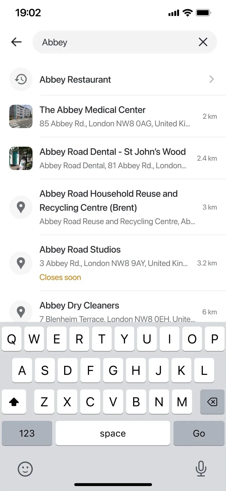
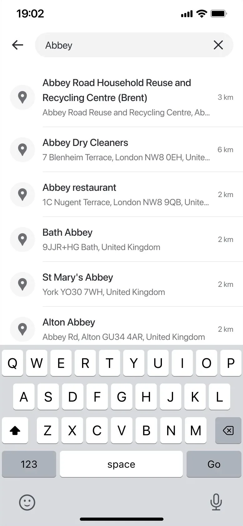
Before: an undifferentiated list. After: the history match comes first, and every result carries a photo and an open/closed status.
The everyday friction
Three kinds of friction
Search bounce rate was creeping up, because the app kept asking people to do work it should have done for them.
Dead ends
Search for something missing and the search just stopped. No suggestion, no alternative, no next move.
Detours to act
Tap a card, get pushed to a detail page, do the thing, then find your way back to browsing.
No memory
No idea what you searched last week, and no answer to the first question: is it open right now?
The trigger
Four goals and one reframe
01
More relevant results
02
Fewer abandoned searches
03
Engagement with what’s found
04
A rethink of how results look
“No results” had always been an edge case. I started treating it as a design problem in its own right.
The wider landscape
How others handle local search
Google Maps
Simplified what a result even looks like, betting that a cleaner map earns more trust than a denser one.
Citymapper
Treated discovery as something that should reward curiosity, tying places to a payoff instead of static text.
Neither was built for Farsi speakers or Iranian places. What we took from both: put the context people need into the result itself, and give them a reason to keep exploring after the first one.
The work
Components built for what you search
I rebuilt the search page around components tailored to the type of place, so a restaurant shows what a restaurant needs and a service shows what a service needs. Search history personalizes what surfaces first. Opening hours moved into the result itself.
BeforeAfter
Empty search
Something to explore before you type
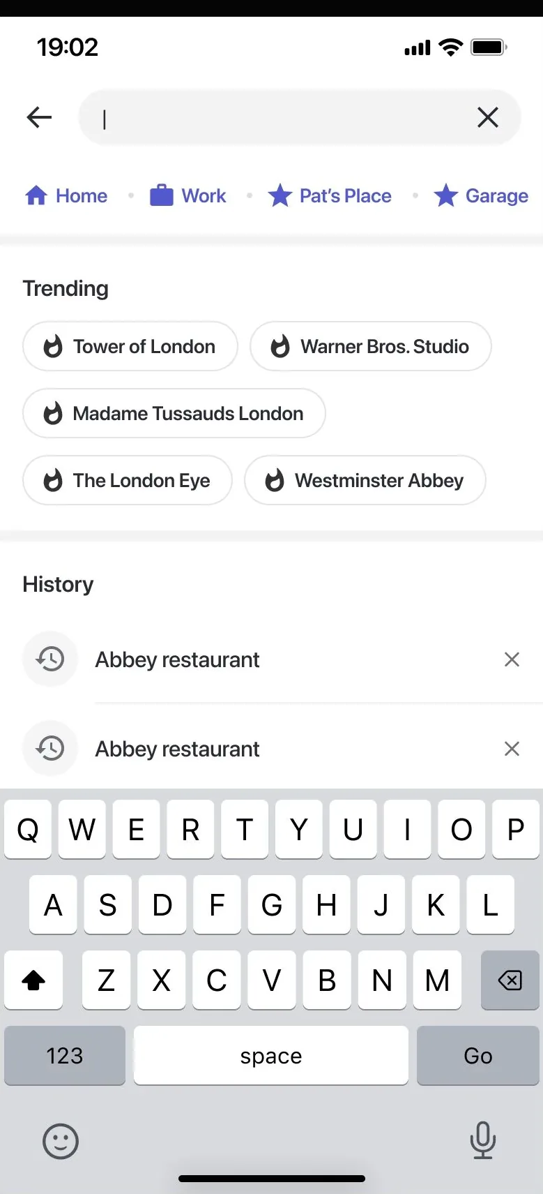
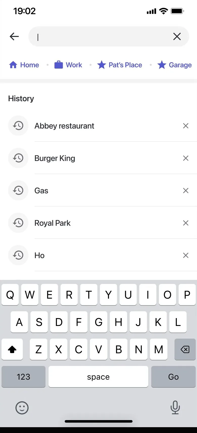
An empty search used to open onto raw history. A Trending section now gives people a reason to browse without a query.
No results
A dead end became a fork
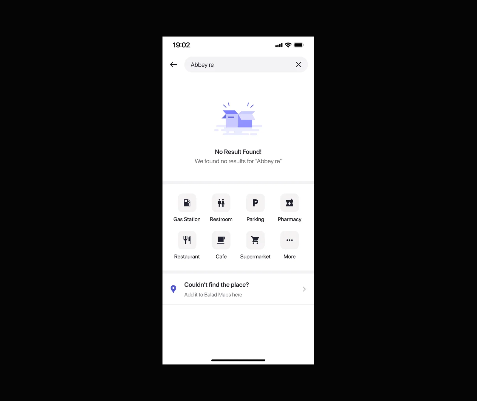
The “no results” screen now offers category browsing (gas station, restaurant, pharmacy and more), plus a way to add the place if it’s genuinely missing from the map.
BeforeAfter
POI cards
Act without leaving the map
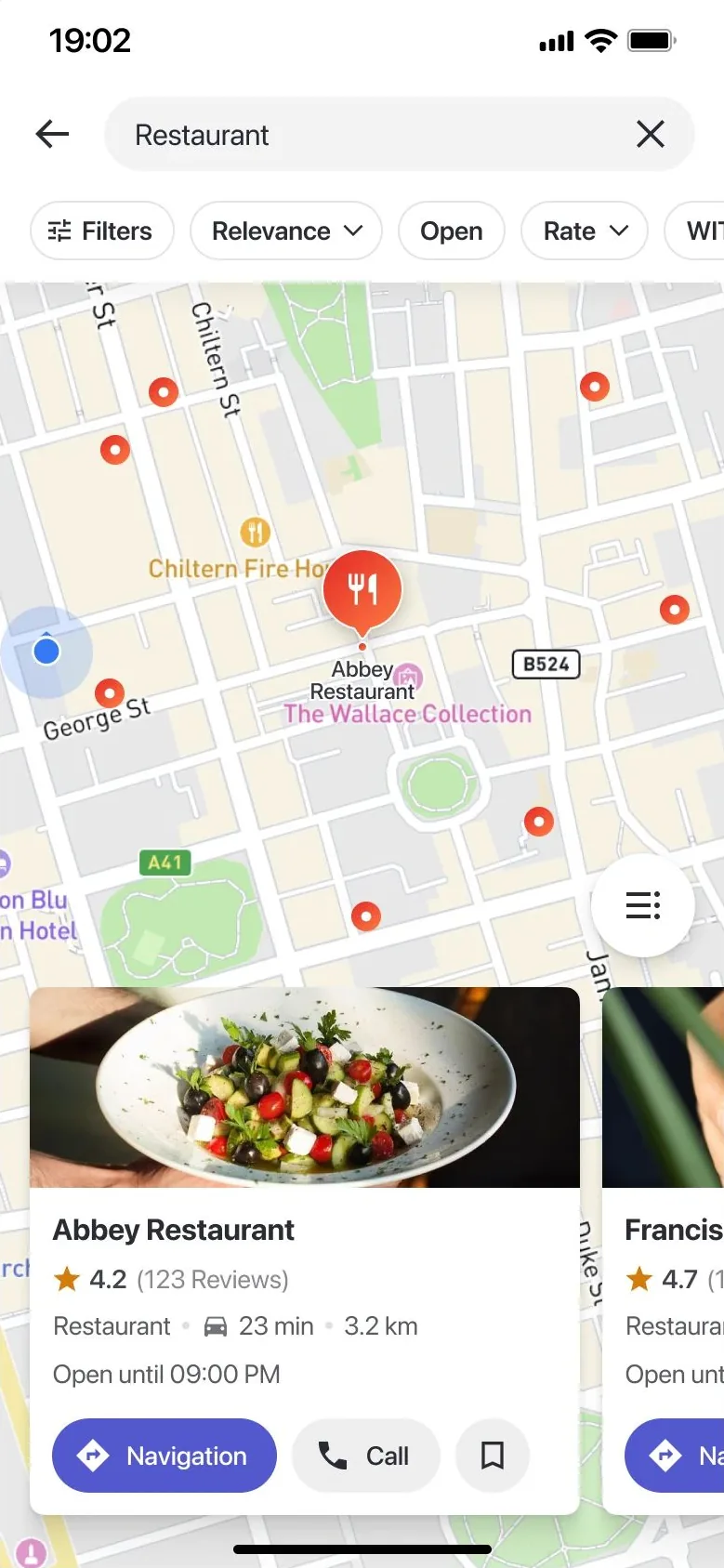
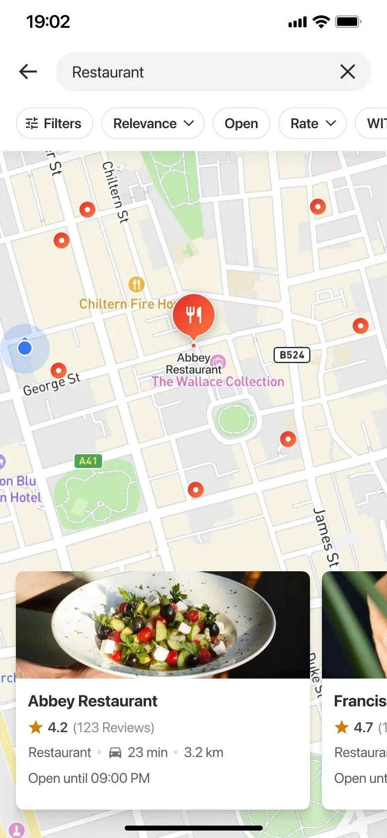
Cards used to show information and nothing else. Navigate, Call and Save now sit right on the card, and a list-view toggle opens up browsing beyond the map.
BeforeAfter
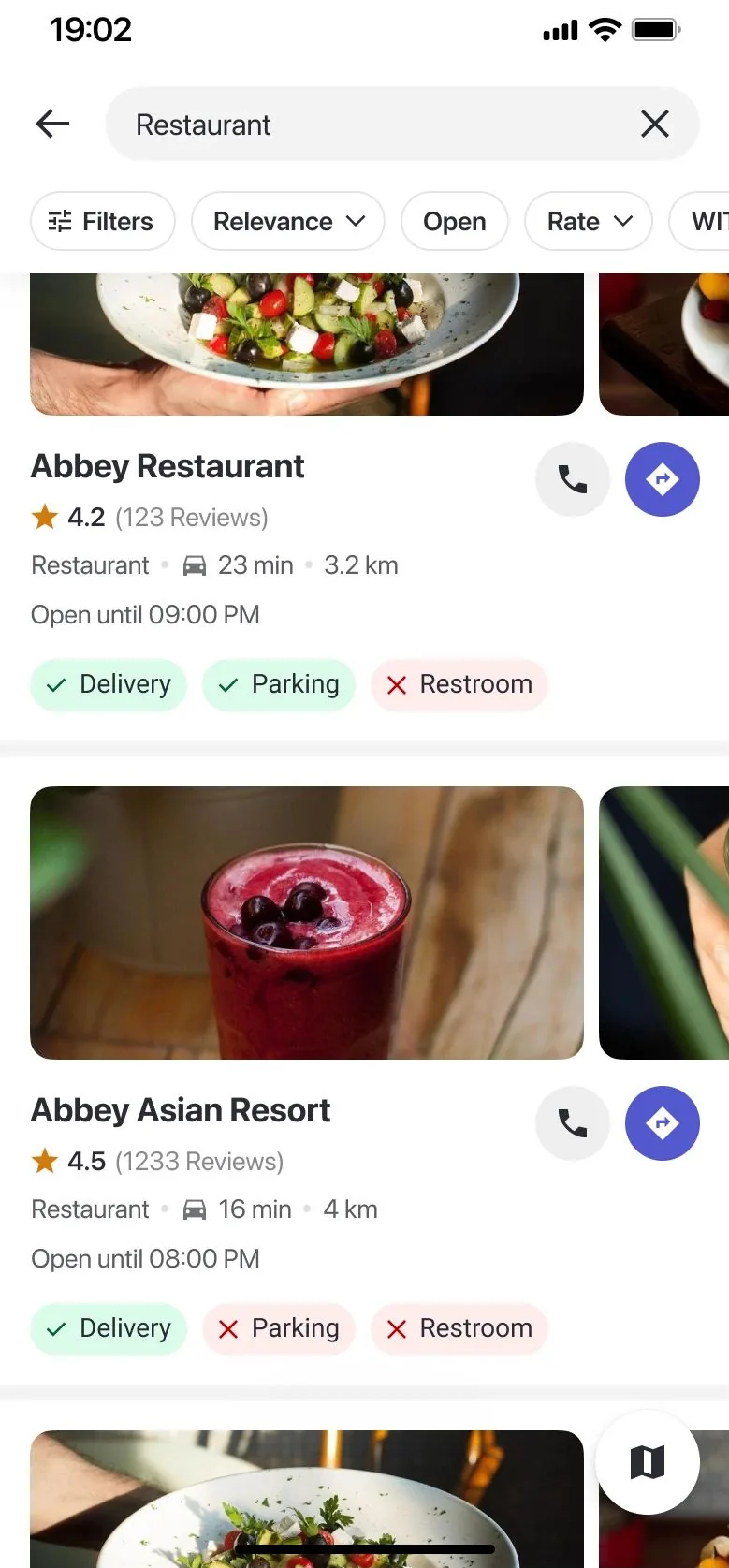
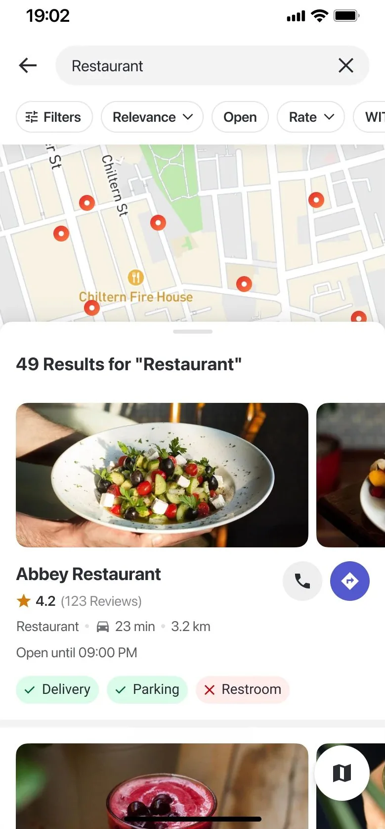
List view
Built for comparing two or three places
People kept weighing places against each other using single cards. The list view surfaces the details that decide it, like delivery, parking and restrooms, with one-tap call and navigate.
The return
What changed after launch
+15%
POI engagement
People used the cards
Engagement with place cards rose after the action buttons and the new card design shipped.
−8%
Search bounce rate
Fewer people gave up
It shipped with the reformatted results, the new empty states and the list view.
Relevance is often a presentation problem before it’s ever a ranking problem.
Opening hours in the results and category browsing after a failed search needed no smarter matching, only better presentation.
A file sharing and management system for Iranian organizations that can’t rely on Google Drive or Dropbox.
Role
Sole product designer
Ecosystem
Graph security suite, integrated with FAM products
Research
Contextual inquiry, diary study, global benchmarks
Partners
Marketing and support teams
+20%Market penetration, year one
+15%Graph’s overall revenue
−40%Time spent managing files
−50%Onboarding time
Introduction
Not another cloud drive
Vault is a specialized file sharing and management system. Its integration with Graph’s security products, especially the FAM line, makes sharing and managing files more secure and more collaborative inside the Graph ecosystem.
I worked on Vault from the start. Our goal was an interface that made organizing and sharing files across platforms simple.
The challenge
Files were the open door
Attacks on Iranian companies were rising, and unsafe files entering their systems were a major risk. Sanctions and security policy ruled out Google Drive and Dropbox. Graph’s FAM products handled file contamination, but managing files inside organizations still fell back on FTP and local tools. They needed an internal solution that was secure and compliant.
User-centric ideation & testing
Watching people work
As the only designer, I ran research with the marketing and support teams, then shaped the flows and interface. Two methods carried the research.
Contextual inquiry
Observing how people in organizations actually move, share and protect files during their working day.
Diary study
Tracking file tasks over time to catch the pain points that never show up in a single session.
What we learned shaped three principles:
Build on Graph’s existing user base
Graph already had customers and solid infrastructure. Linking Vault to other Graph products gave users one familiar, secure place to manage and share files.
Make it usable for everyone
Adoption depended on an interface that worked regardless of technical skill, so we worked to minimize complexity at every step.
Streamline data flow
Refining how data moves between Vault and Graph’s services removed disruptions and made file workflows faster.
The process
A redesign, without stopping the business
Stakeholders wanted a full redesign after research, but production constraints meant Graph’s current products had to keep selling. So I set up a five-step process for the new Vault team.
Keep Graph’s current selling products healthy while Vault is in development, fixing usability issues during the maintenance phase.
Define one primary persona to guide every design decision and address specific needs.
Restructure scenarios around the primary persona’s daily work, so interactions and workflows follow how they actually work.
Prototype new solutions for Vault’s information architecture to make files easier to find and act on.
Test the new solutions rigorously to validate them and catch problems before launch.
Designing the Vault
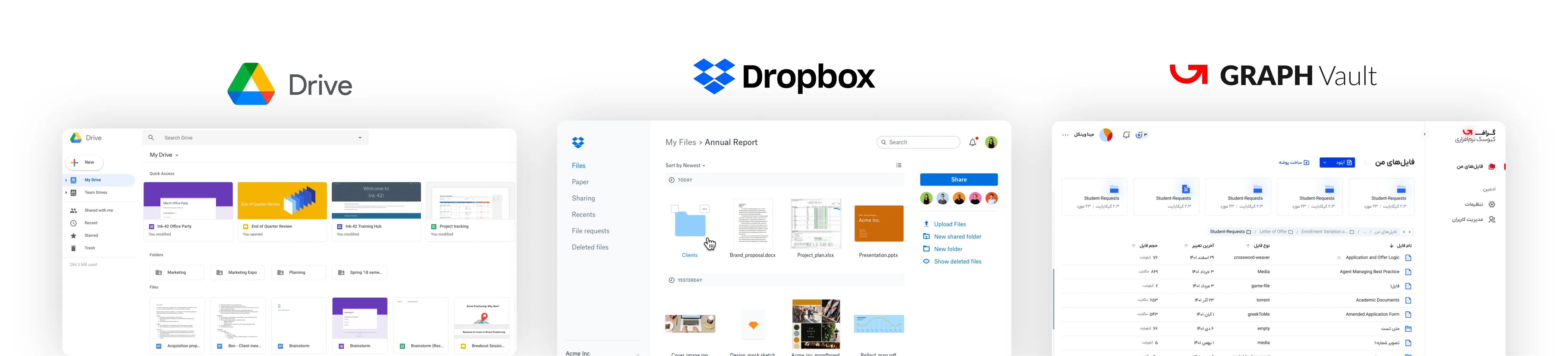
Benchmarks: Google Drive and Dropbox
We compared three areas: file discovery, sharing and management, and integrations. Google Drive and Dropbox set the bar for patterns and expectations.
Drag to explore
Product tour
Find it, share it, connect it
Intuitive organization and clear categories, so finding a file takes fewer steps.
One place to organize documents and share them securely across platforms, with every upload scanned by Graph.
Vault connects with the rest of Graph’s suite, including files sent from the Kiosk, so people move between products in one workflow.
Impact
What changed for customers and for Graph
Market penetrationIn the Iranian file-security market, within the first year.
+20%
RevenueGraph’s overall revenue, with Vault as a key generator.
+15%
Third-party file toolsReduction among customer organizations within six months.
−30%
Security solutions uptakeAdoption of Graph’s security products through the FAM integration.
+25%
Time managing filesThanks to integration with Graph’s other products.
−40%
Trust in data securityConfidence that files are protected.
+35%
Onboarding timeFamiliar patterns made the learning curve short.
−50%
Satisfied usersPost-launch evaluation of file management and security features.
85%
Vault shipped as part of Graph’s security suite, and became where its customers keep and share files.
A complete design process with the emphasis on process: requirements, competitors, personas, problem statements, prioritization, information architecture and a UI kit.
Role
Product designer, end to end
Platform
Mobile, Farsi (RTL)
Methods
Competitor matrix, personas, 5W1H, red routes, IA
Deliverables
UI design, prototype, design system
Approach
Four phases, in order
Here’s how I take a design task from a blank page to a shippable UI.
Understand the client’s requirements, the target audience and the market, through interviews, surveys and research. Here: requirement analysis and competitor analysis.
Define goals, objectives and design strategy with stakeholders, aligning the product vision and key features. Here: personas and problem statements.
Organize and structure the content for intuitive navigation, using wireframes and prototypes to set the hierarchy. Here: feature prioritization and information architecture.
Create on-brand high-fidelity mockups and interactive prototypes, then iterate on feedback and usability testing. Here: UI design and design system.
Phase 1 · Understand
Requirement analysis
Who are the target users?
Mobile job seekers at every level, from entry-level to executive. Usually looking for a new job, sometimes researching careers or companies.
What are their needs and pain points?
Finding jobs that fit their skills, and applying quickly. The biggest pain is time: hours on job boards and filling in online applications.
Which features are a must?
Search by location, title and other criteria
Job details: description, salary range, company info
Apply online or with a résumé
Save jobs for later
Track applications
What’s the user journey?
Create profileSearchView detailsApplyTrack status
What does the market look like?
Crowded, with Indeed, LinkedIn and Glassdoor holding large user bases. The trend is mobile-first, so the app has to work beautifully on a small screen.
Phase 1 · Understand
Competitor analysis
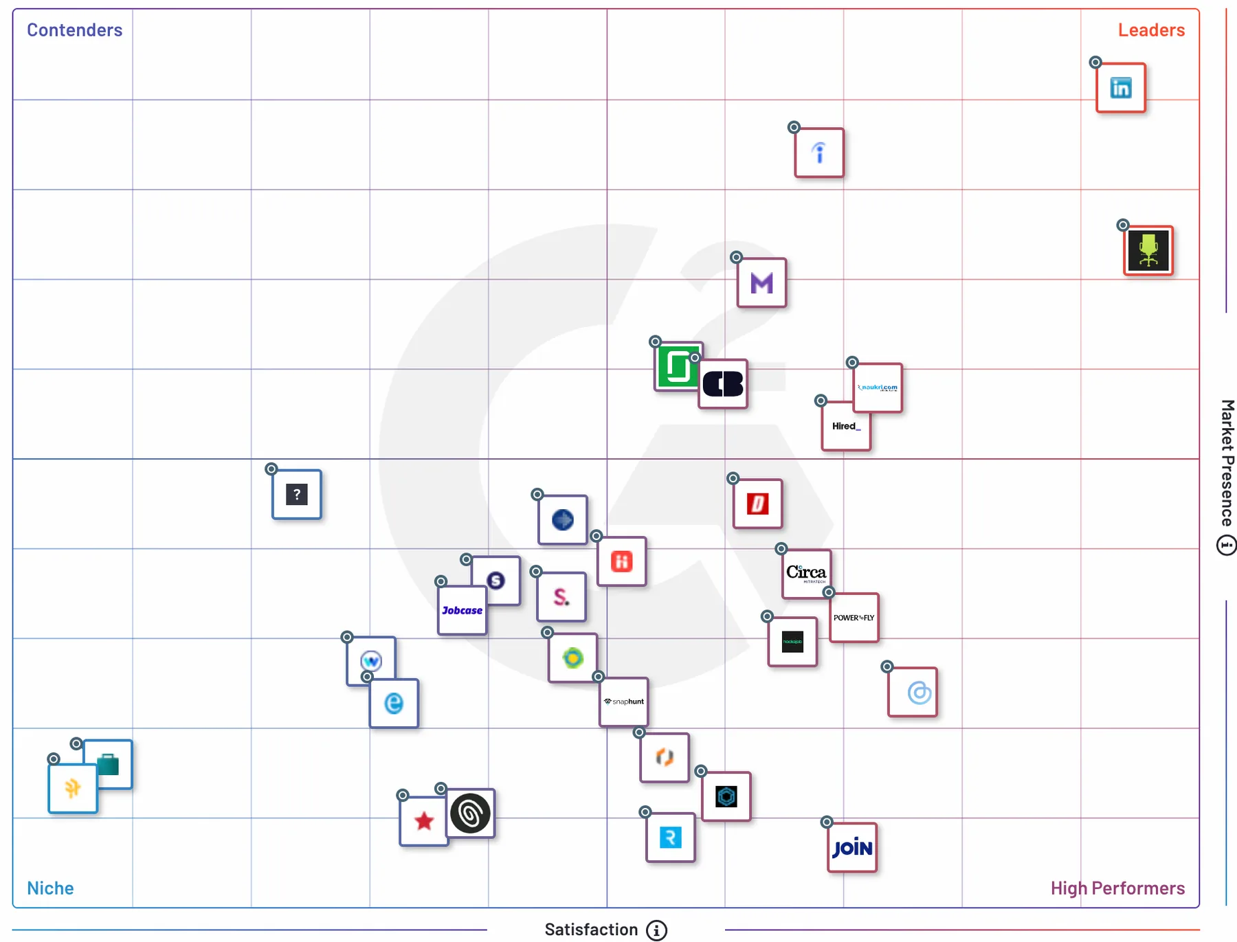
Industry leaders according to G2. Pick one to see where it’s strong and where it falls short.
Strengths
A huge professional network: the go-to place for connecting with employers, with job listings, company pages and communities.
Weaknesses
Job search is less complete than dedicated engines, and advanced search sits behind a paid subscription.
Strengths
A vast database aggregated from many sources, with strong filters for location, salary and job type.
Weaknesses
Aggregation means uneven listing quality, and fewer personalized recommendations.
Strengths
Company reviews, salary data and culture insights give job seekers real transparency.
Weaknesses
Search is less extensive, and user-generated reviews and salaries vary in reliability.
Strengths
Résumé building, personalized recommendations, market insights and a big résumé database for employers.
Weaknesses
A less intuitive interface, and a hard time standing out among established engines.
Strengths
AI matching that simplifies search and hiring, with résumé tools and applicant management.
Weaknesses
Less brand recognition and reach, which makes a broad pool of listings harder to attract.
G2 grid for job search platforms: contenders, leaders, niche and high performers.
Feature matrix
Pick a platform name to focus its column.
Feature
Phase 2 · Define
Five people looking for work
General personas to start with, narrowed down later to match each iteration’s requirements. Tap a card to see what stands in their way.
S
Sarah, the professional
Find a job that fits her career goals, see complete listings, grow her network and simplify applying.
Challenges
Sorting through too many listings, little insider information about companies, and networking is hard.
J
John, the new graduate
Land an entry-level job in his field, gain experience and explore career paths.
Challenges
A small network, no industry connections, and entry-level roles are hard to find.
C
The career switcher
Advance her career, move to a new industry, and find senior roles that match her expertise.
Challenges
Navigating a change of field, matching her skills to new roles, and building a network in a new industry.
F
The freelancer
Find short-term projects and gigs, and connect with clients who need his skills.
Challenges
Few full-time options, a flexible schedule to manage, and an inconsistent income.
L
Lisa, the intern
Gain practical experience through internships or apprenticeships and build industry skills.
Challenges
Limited experience, competing with stronger candidates, and finding room to grow.
Phase 2 · Define
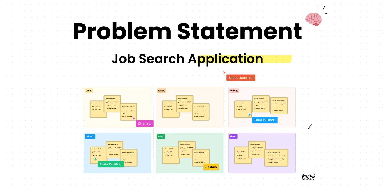
The problem, in 5W1H
Job platforms lack personalization, deep company insights, real networking and good application management, so job seekers struggle to find the right opportunities.
Job seekers, wading through huge numbers of listings with little company information, few connections and messy applications.
Across the job search app industry, where current platforms fail to offer a seamless, user-centered experience.
Right now. People feel frustrated and inefficient during their search because of these gaps.
Missing personalization, insights, networking and application tools lower satisfaction and make it harder to land the job they want.
An app with personal recommendations, deep company insights, strong networking and efficient application management that closes the gap between people and the jobs they want.
The problem statement board in FigJam.Phase 3 · Conceive
Red routes first
The red route technique ranks features by the critical paths users take most. It keeps the work user-centered, spends limited resources on what matters, validates the core early and gets a useful product to launch sooner.
Foundation and core features. The scope of this task.
Registration & profile
Name, contact details and experience, so the search can be personal.
Job listings
A clear list with filters for location, industry and experience level.
Advanced filters
Salary range, job type and company size to narrow results down.
Personas served: Sarah (profile and saved jobs), John (entry-level listings and filters) and Lisa (internships through search and filters).
Personalization and connection.
Networking
Profiles, connections, messaging, industry communities and forums.
Recommendations
AI suggestions from preferences, behavior and saved searches.
Company insights
Culture, employee reviews, benefits, values and growth.
Streamlining the application process.
Résumé builder
Custom templates for skills, experience and education.
Application tracking
Status, reminders for interviews and deadlines.
Interview prep
Tips, sample questions and best practices.
Phase 3 · Conceive
Information architecture
Focused on iteration 1’s critical paths: search, read a listing, apply, and keep track.
 ,
, Wallex
 Snappfood
 Graph Inc.
 Cafe Bazaar